6
weeks
10
online workshops
we talk on Mondays and Thursdays in Zoom and draw together
8
recorded videos
about history, materials, typography, and so on

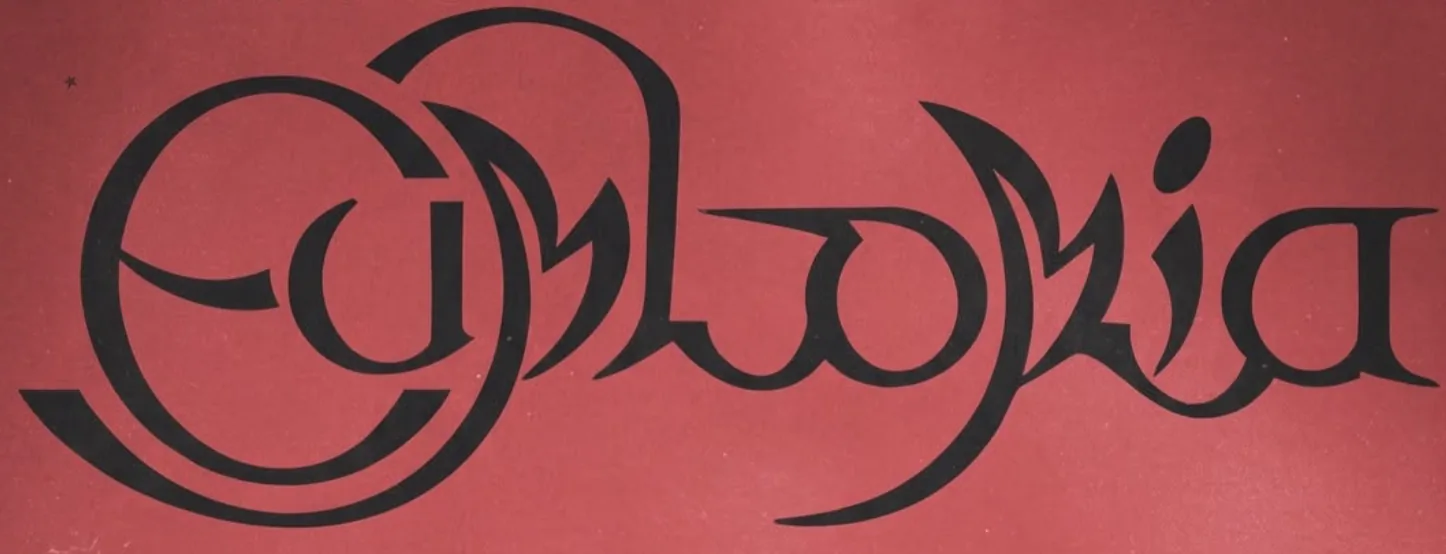
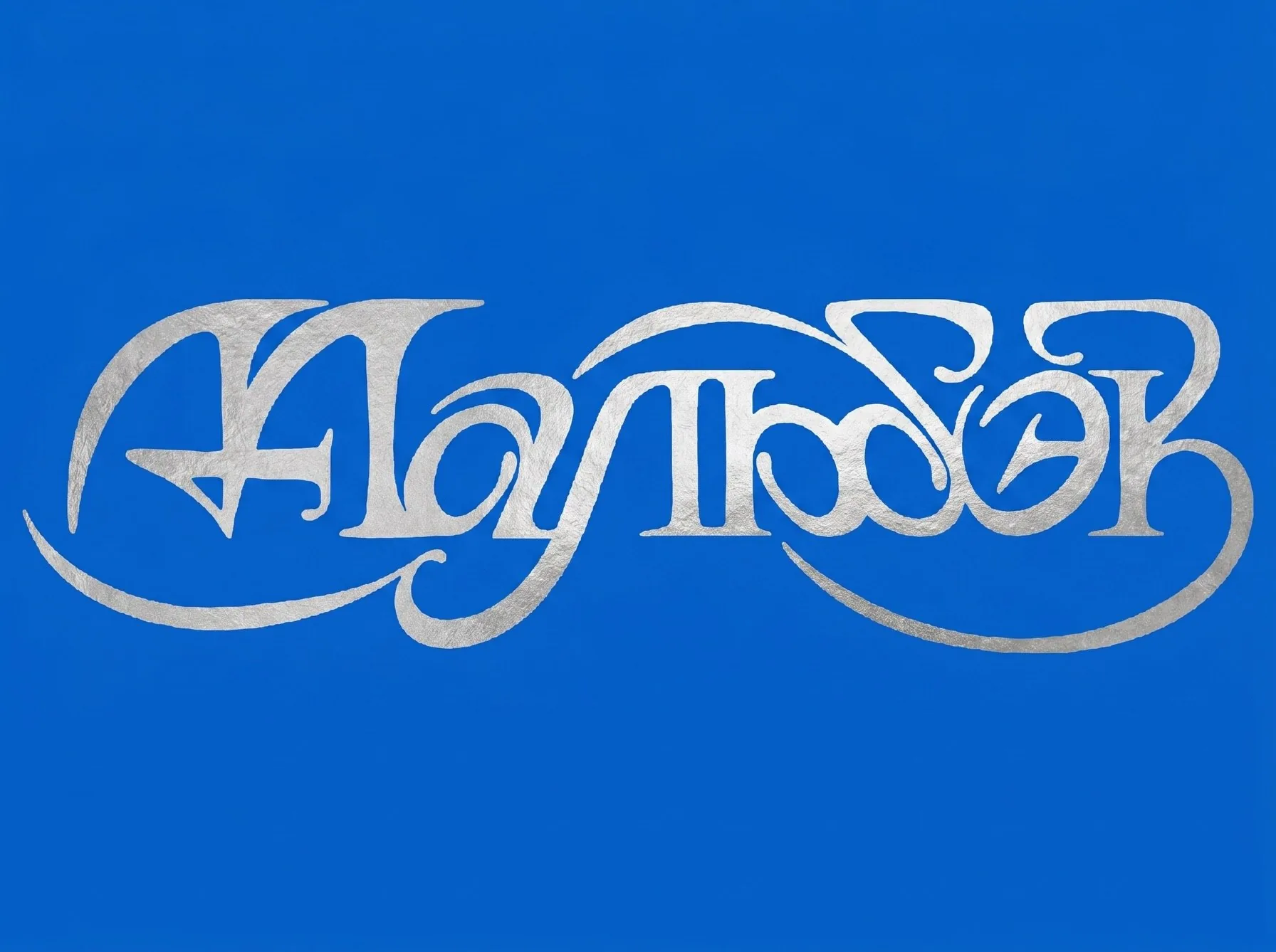
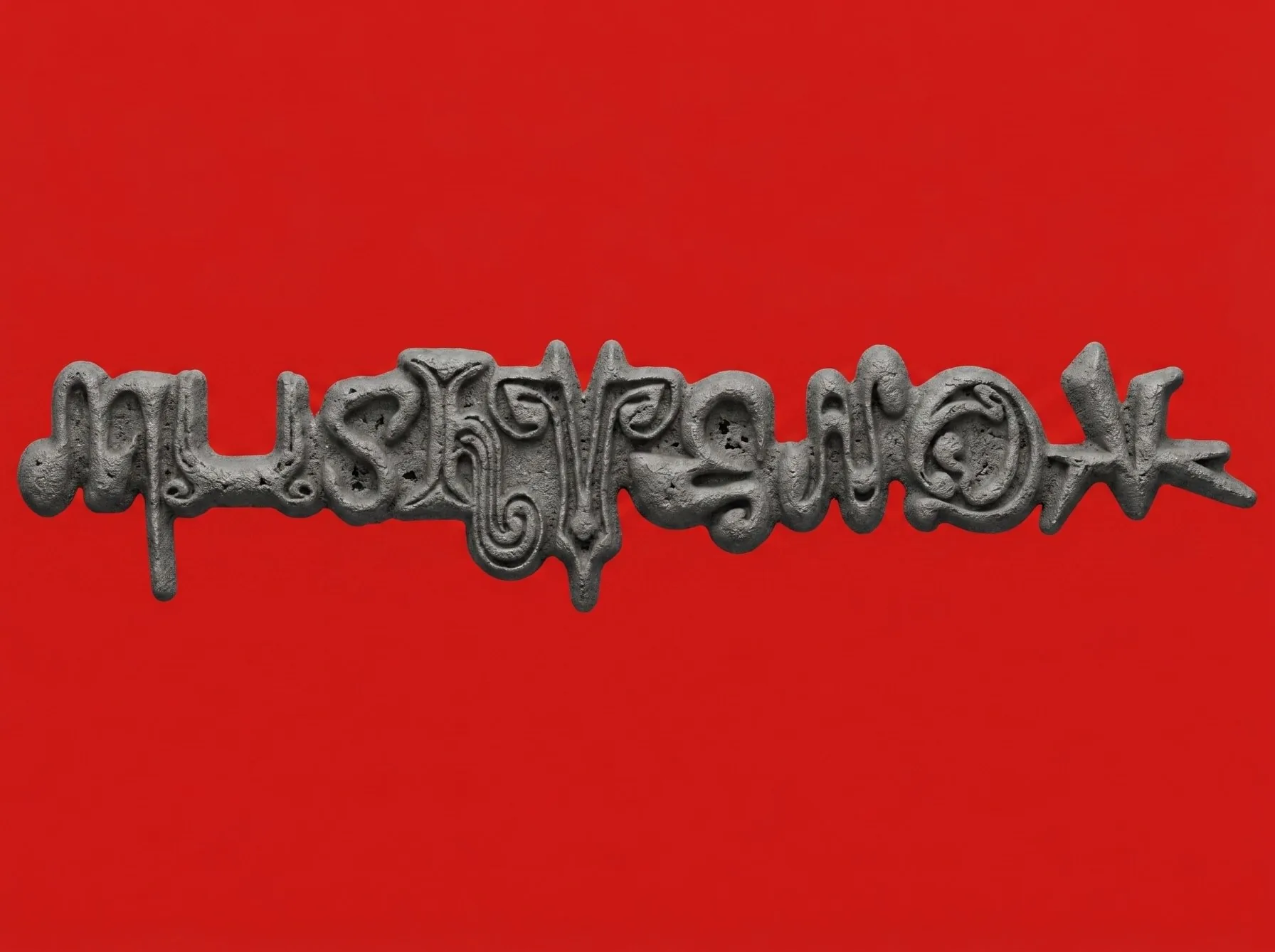
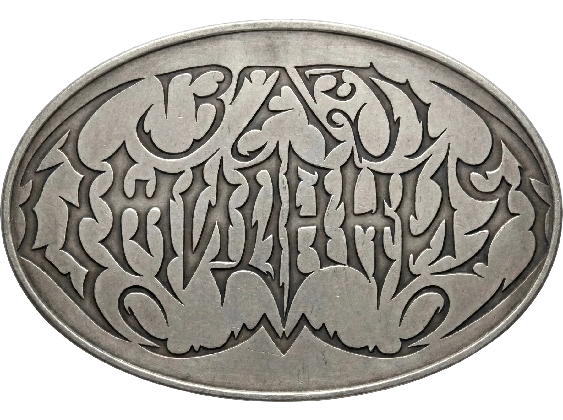
program
1 week
- История леттеринга и отличие от каллиграфии запись
- Инструменты и пайплайны запись
- Авторы, насмотренность, референсы запись
- Обсуждение тем для финального проекта 3 сентября, Четверг звонок
2 week
- Готическая каллиграфия 7 сентября, Понедельник воркшоп
- Пять стартовых упражнений 10 сентября, Четверг воркшоп
- Перевод надписи в диджитал запись
- Экспериментальная типографика: правила вёрстки и их разрушение запись
3 week
- Вариативная стилизация надписи 14 сентября, Понедельник воркшоп
- Модульная типографика запись
- Леттеринг + типографика, работа с титрами запись
4 week
- Модульная типографика 21 сентября, Понедельник воркшоп
- Работа с эффектами запись
- Нейросети для рисования/обработки букв запись
5 week
- Консультация-предпросмотр 28 сентября, Понедельник звонок
6 week
- Финальный просмотр работ 5 октября, Понедельник просмотр
- Что делать (с жизнью) после курса 8 октября, Четверг звонок
student progress


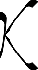

yan @l200kmhinthewronglane
1 week
4 week

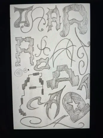

polina @pelagieon
1 week
3 week
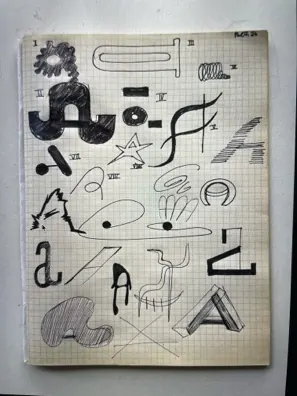
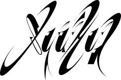

alena @alenapichh
1 week
4 week
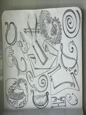


alena @alenapichh
A review will go here.
1 week
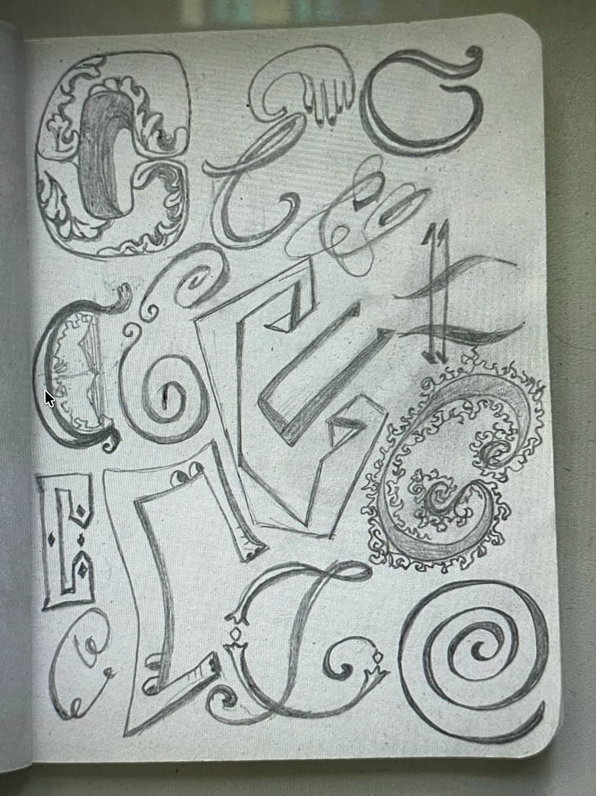
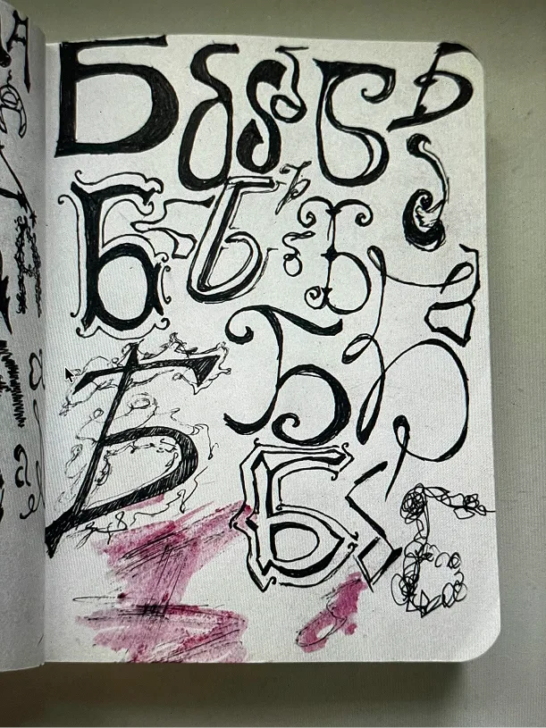
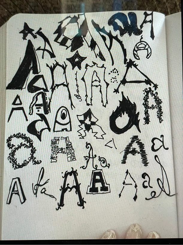
2 week
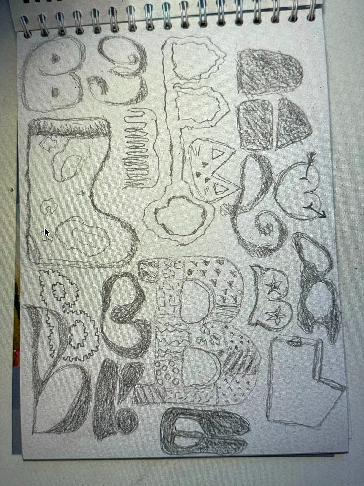
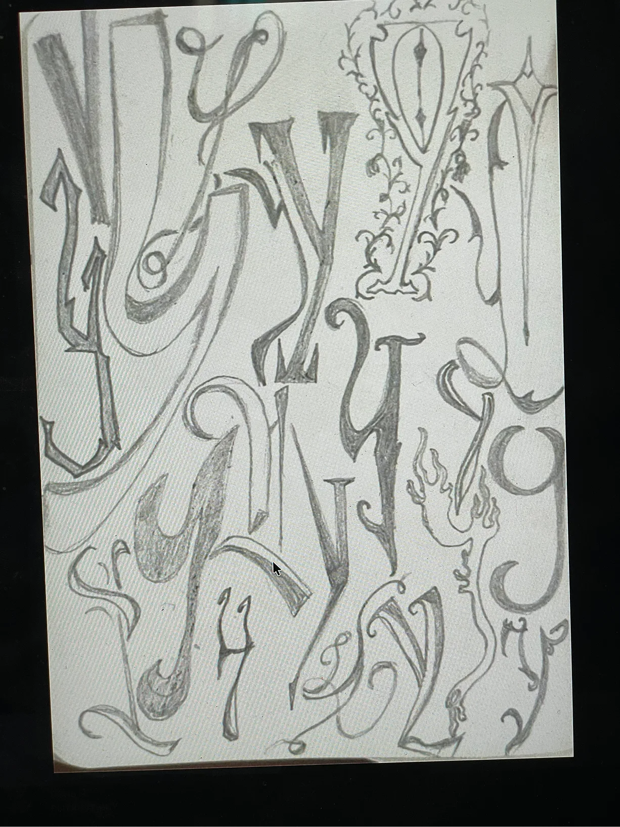
3 week
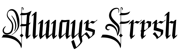

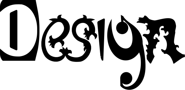
4 week


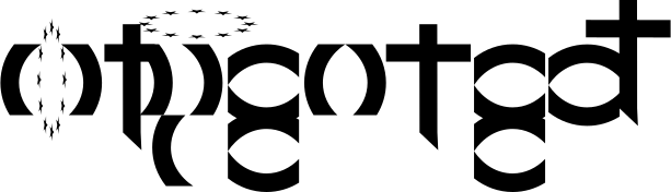

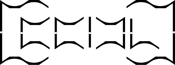
5 week (not yet)
6 week (not yet)
Final project (not yet)
yan @l200kmhinthewronglane
A review will go here.
1 week
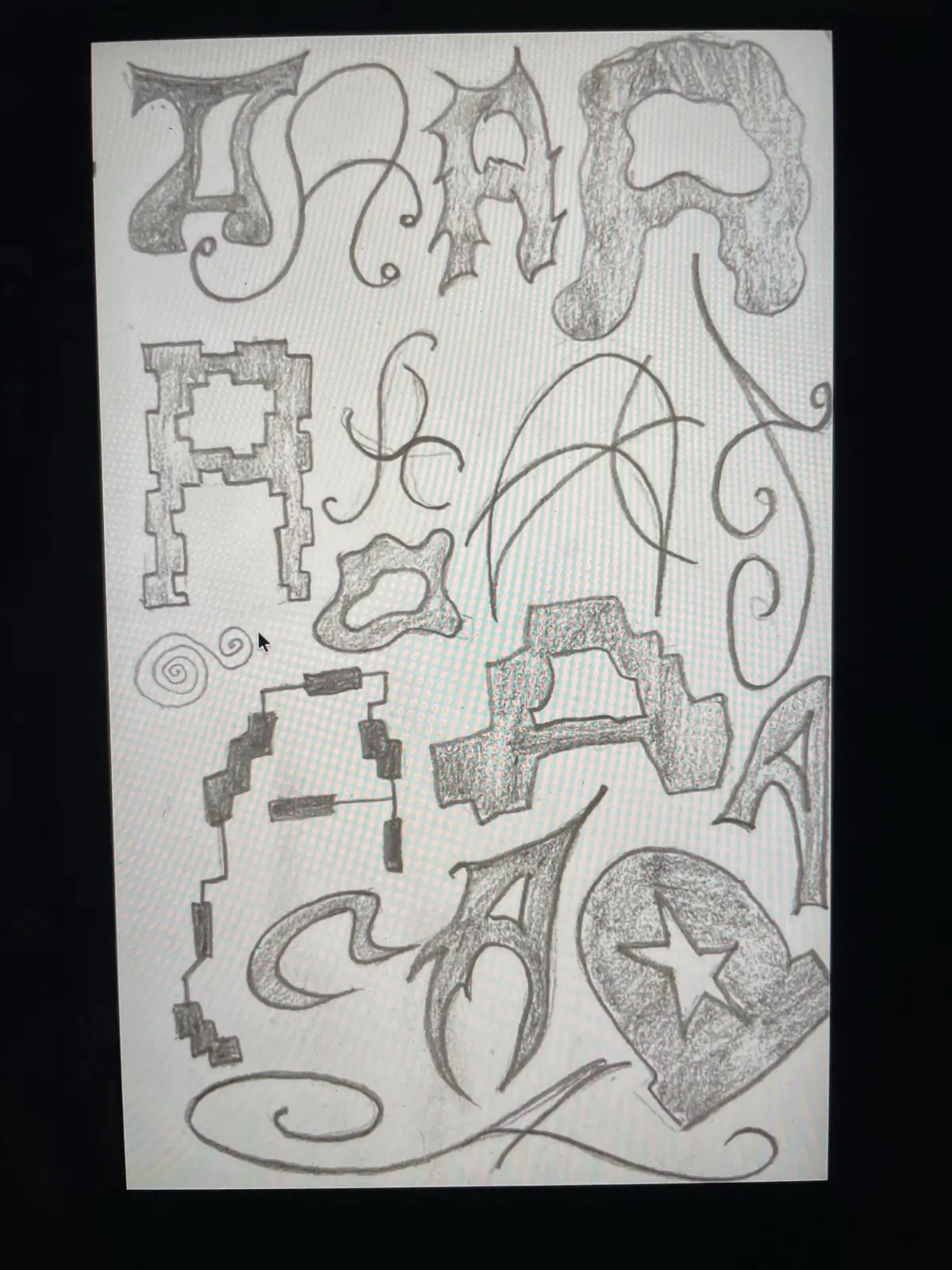
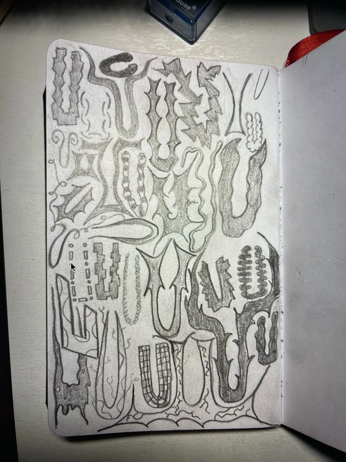
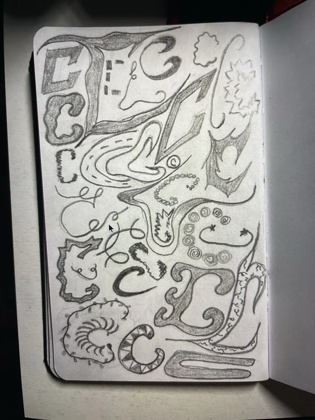
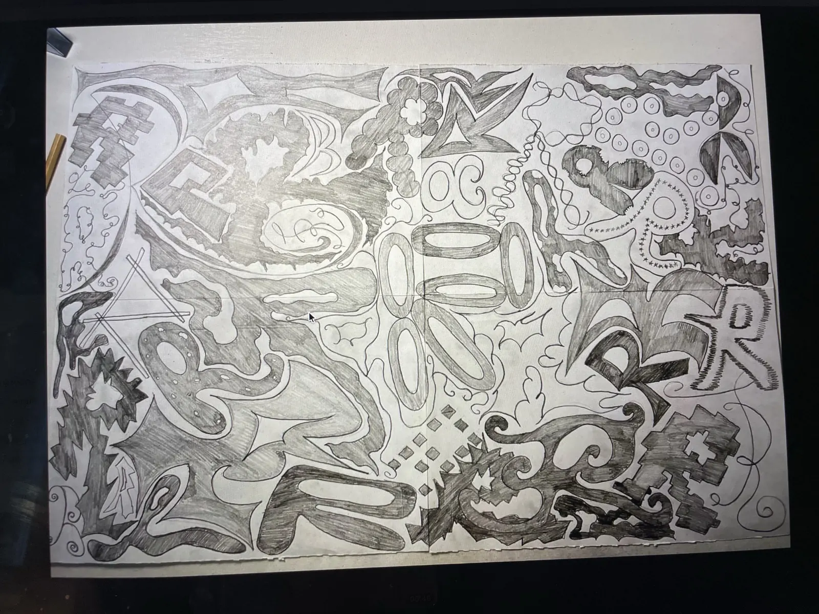
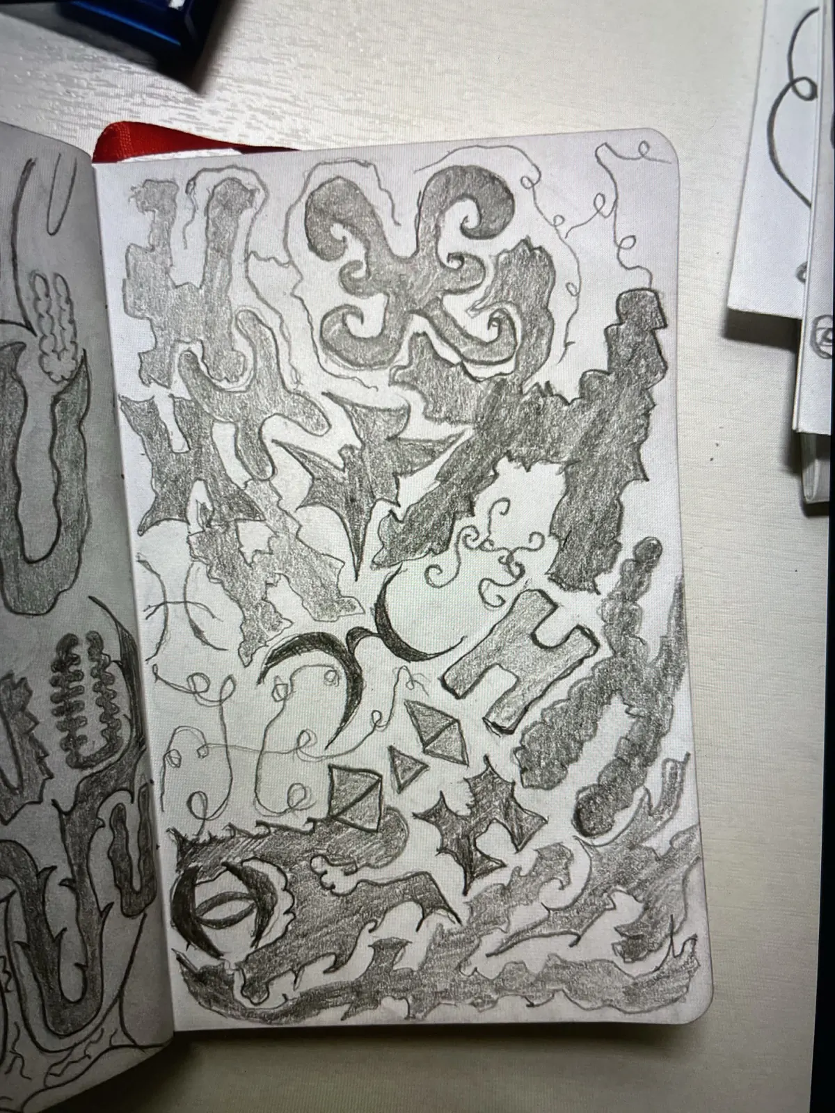
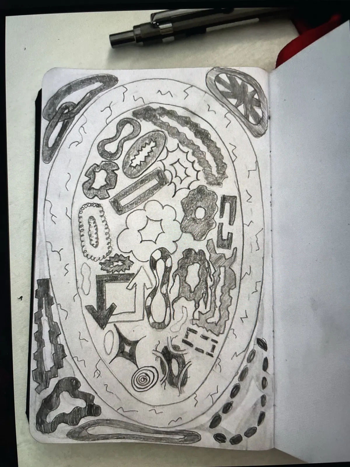
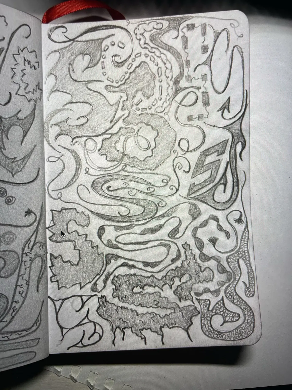
2 week
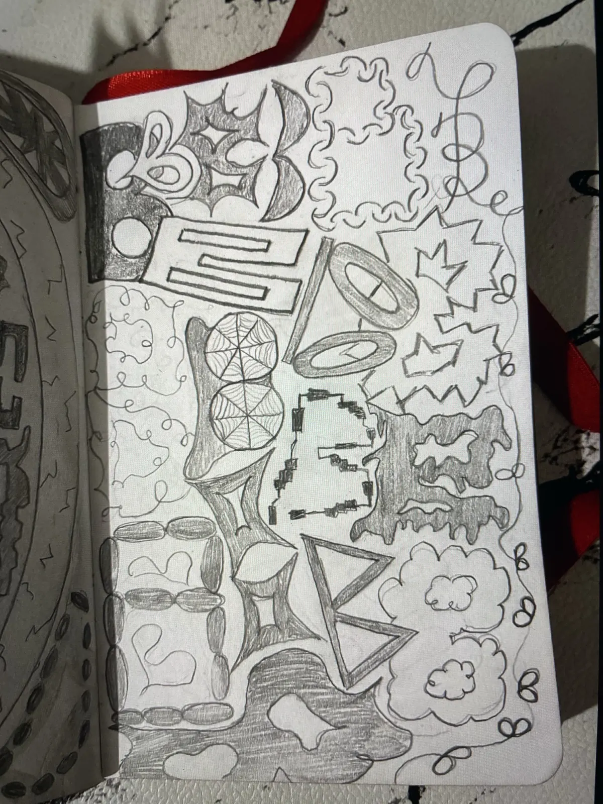
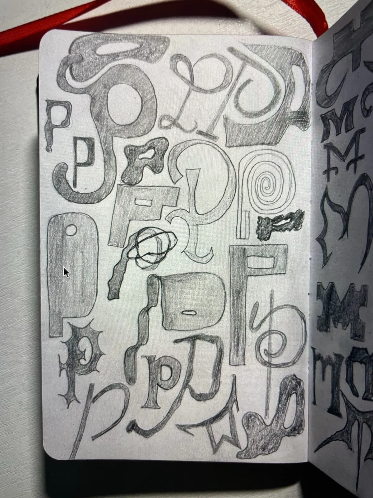
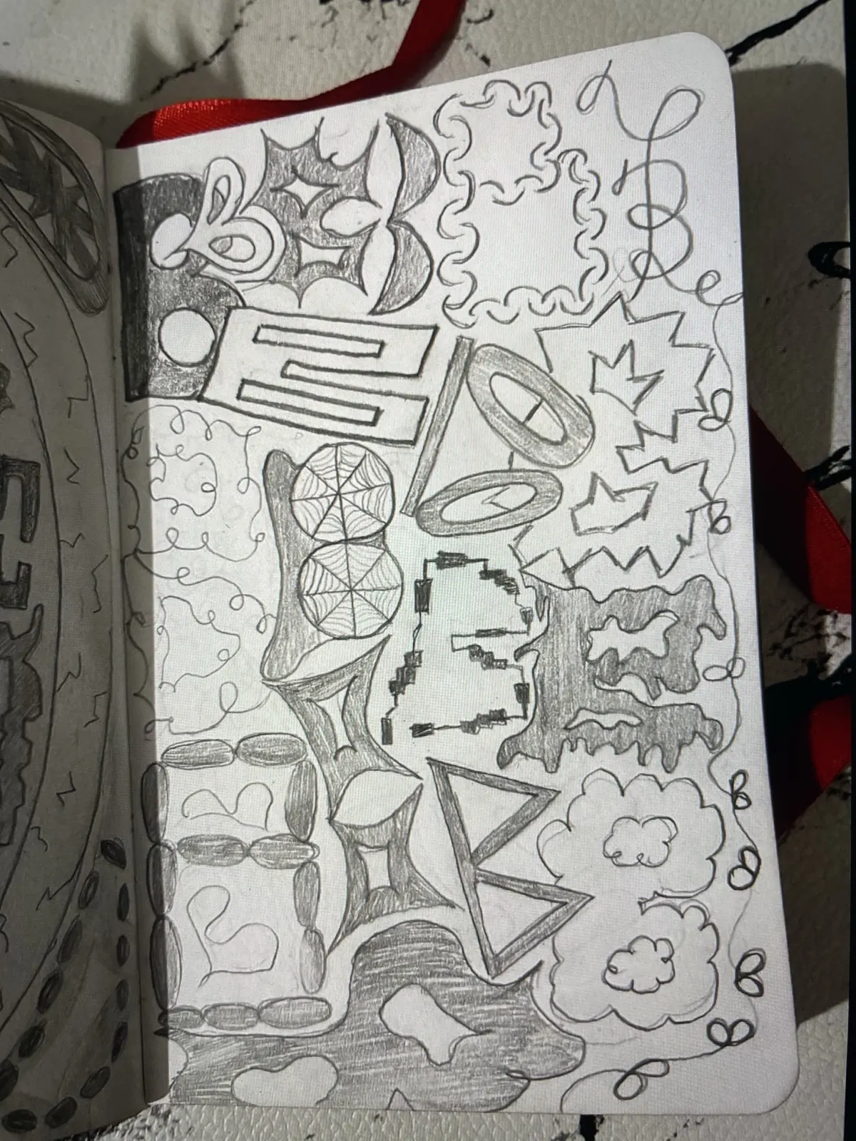
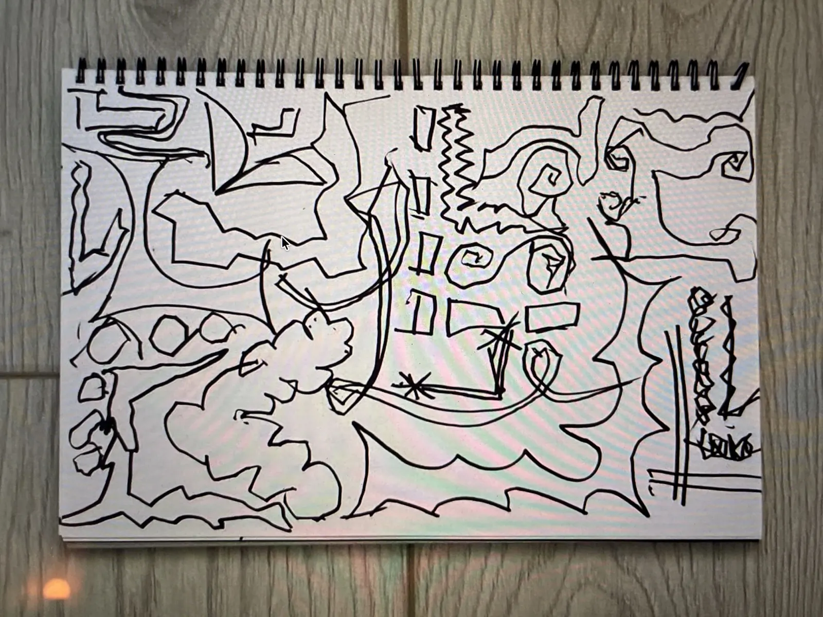
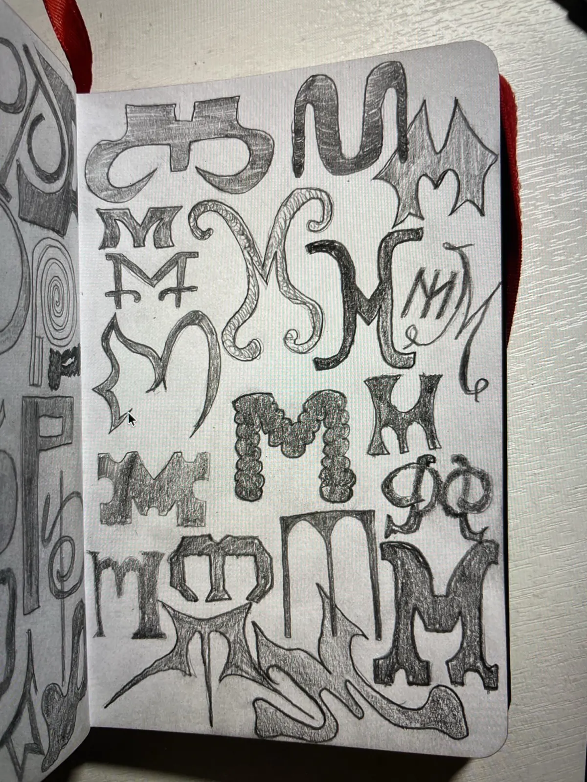
3 week
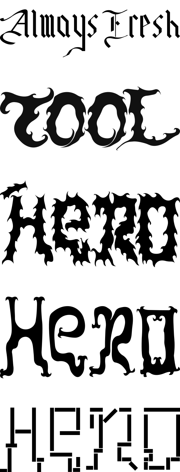
4 week
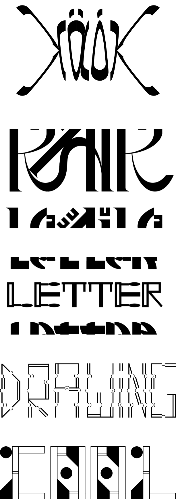
5 week (not yet)
6 week (not yet)
polina @pelagieon
A review will go here.
1 week
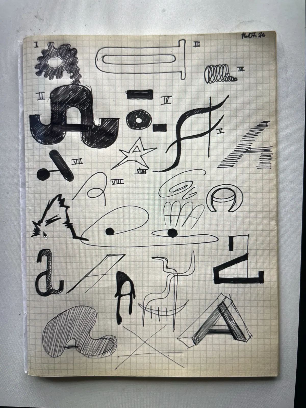
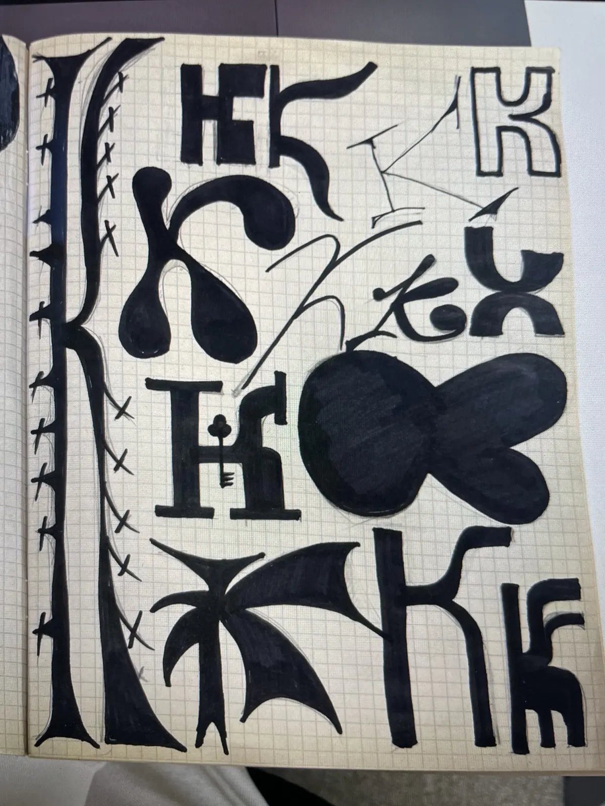
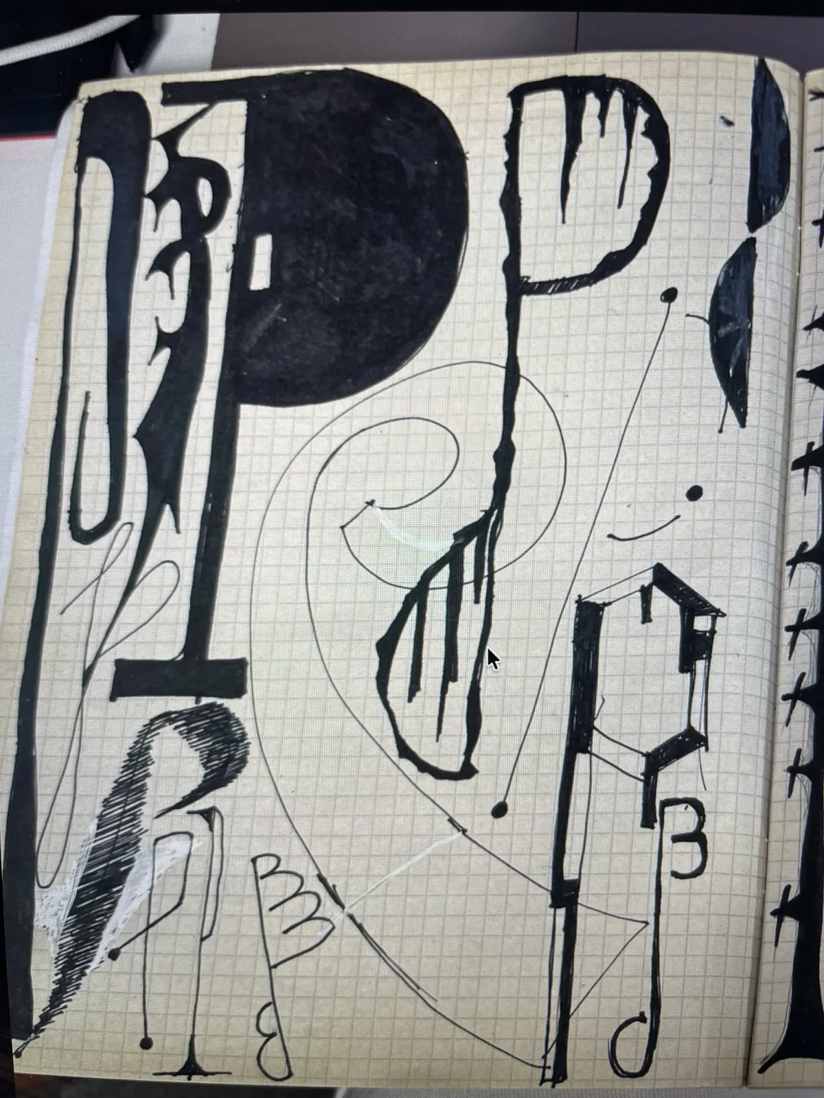
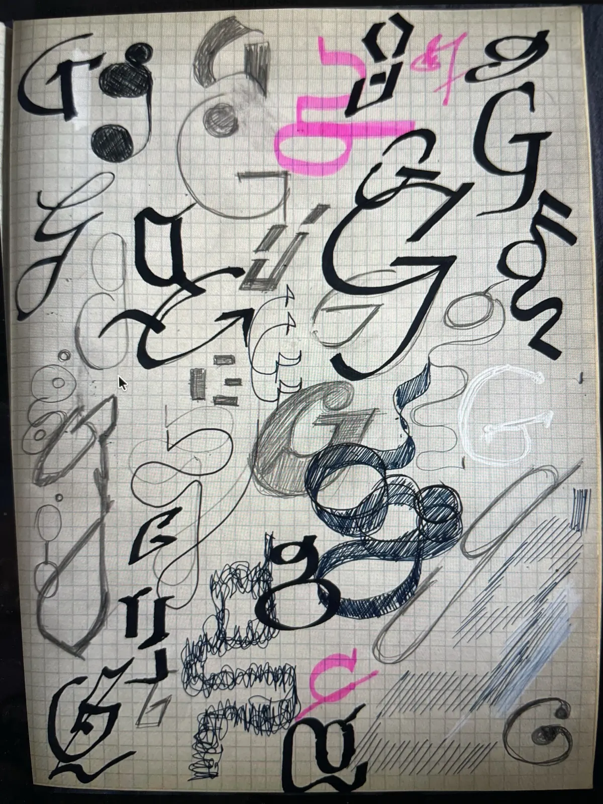
2 week
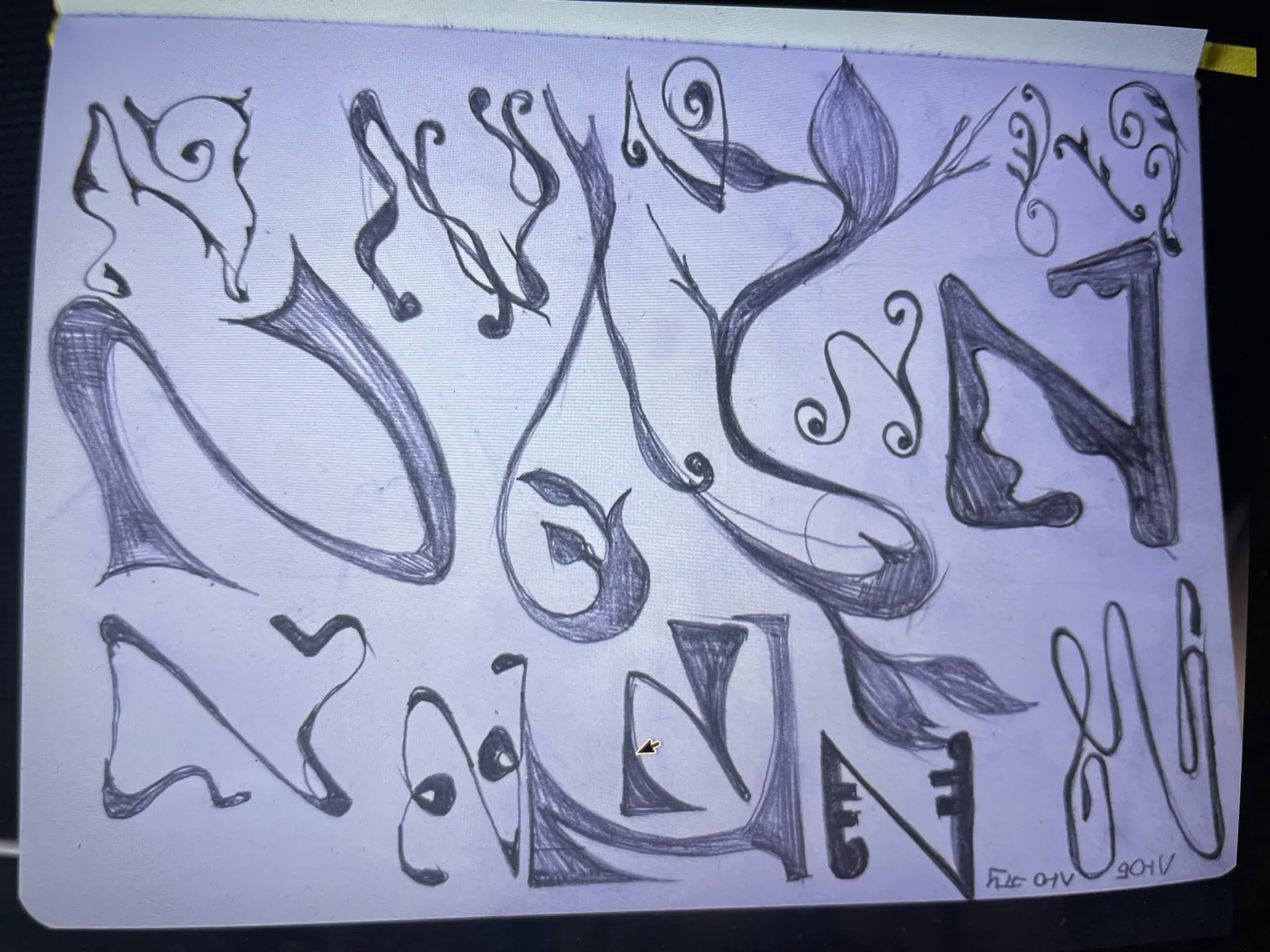
3 week
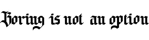
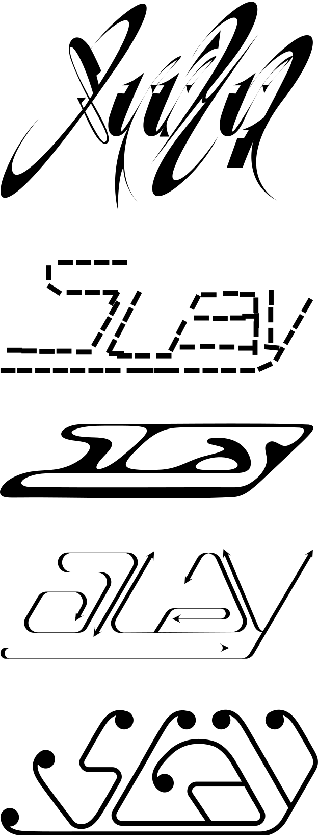
4 week
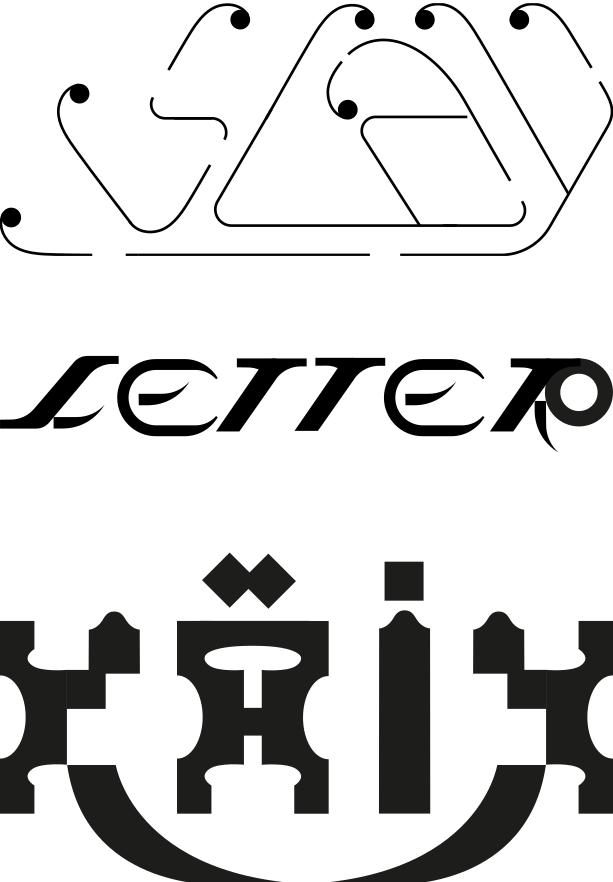
5 week (not yet)
6 week (not yet)

student works
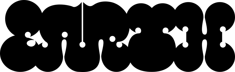
Алёна @alenuchotam
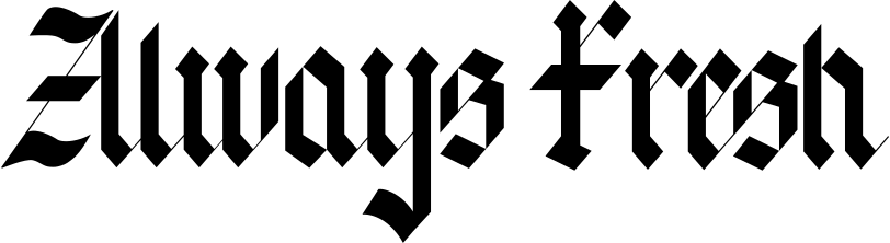
Андрей @iamprpl
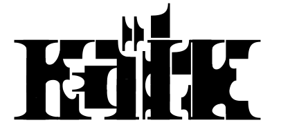
Кира @k1pk1p
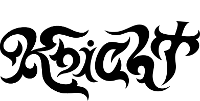
Надя @oh_narcy

Маша @mashaaaaaam
Маша Полина @pelagieonmashaaaaaam
Алёна @alenuchotam
Данил @fursovdm
Полина @pelagieon
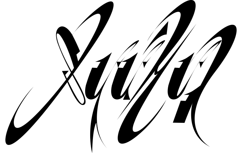
Полина @pelagieon

Кира @k1pk1p
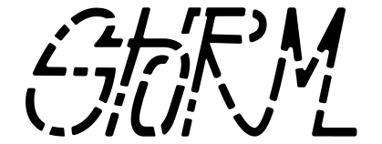
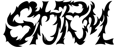
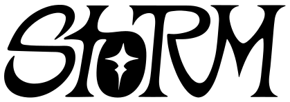
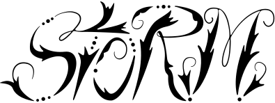
Андрей @iamprpl

Рома @rameoky
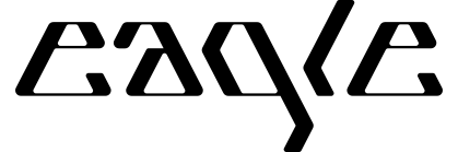
Андрей @fovkotov
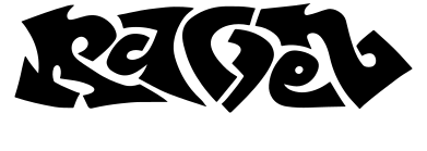
Надя @oh_narcy
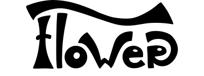
Ксюша @dirigible4
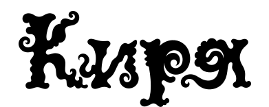
Ксюша — @dirigible4
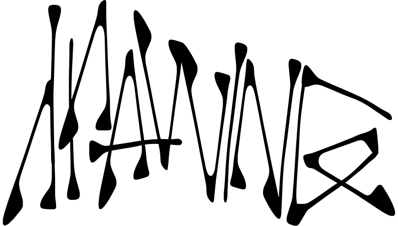
Богдан @Ybludok47

Алена @alenapichh
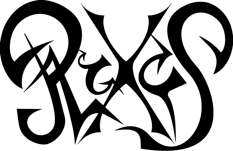
Катя @hurujoi

Надя @oh_narcy

Ян @l200kmhinthewronglane
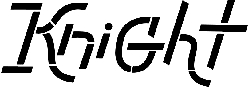
Надя @oh_narcy
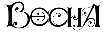
Ксюша — @dirigible4
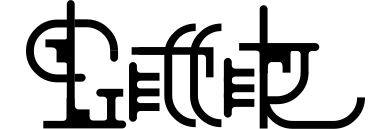
надя + @oh_narcy

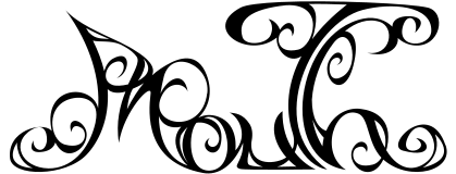
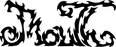
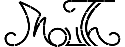
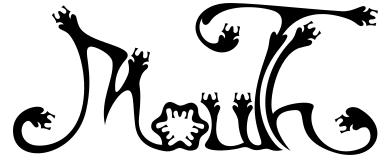
Аня @dontcatchbirds

алёна @alenuchotam
three exercises to create beautiful letters
1
Choose one letter. Come up with and draw as many variations of its shape as possible in 10 minutes, regardless of the references.
2
Find a long stick. Attach a pen to the end of it, and try to draw as many letters as possible in 10 minutes, holding the stick with your left hand.
3
Choose the inscription that you like. Anything from a word on an album cover to a street sign. Try to copy it first in a minute, then in 10, then in 30.
a recording of the final review will appear here soon...


questions and answers
1
Do I need a graphics tablet?
No, a graphics tablet is not required. But if you have one, it will be more convenient to work with.
2
What will I need?
Adobe Illustrator, Adobe Photoshop, Figma
Materials for making letters: paper, pencils, pens, markers, etc.
3
Still have questions?
Ask them here: @vanokregular
if you're still bored...
A Very Brief Visual History of Letter(-ing).
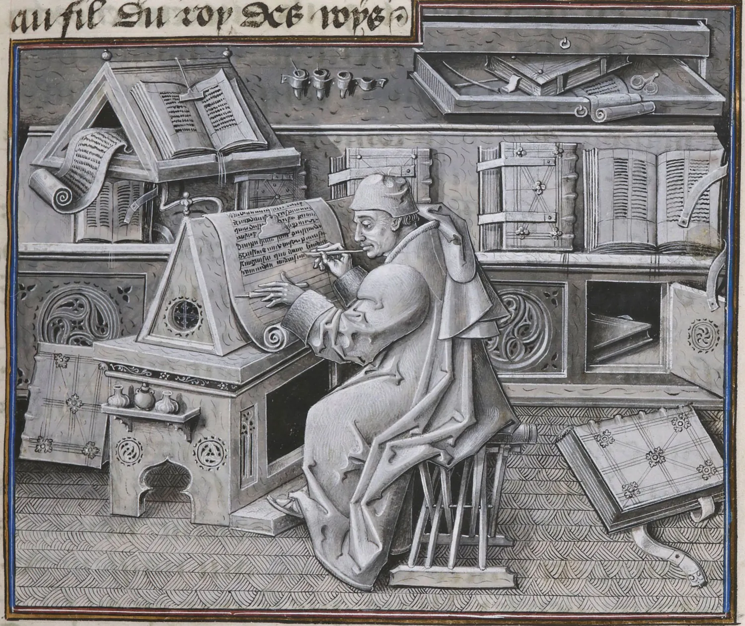
As a species, people need communication. People also love beautiful things. Lettering, or the Art of Drawing a Letter, emerges from combination of this two existential requirements.
↳ The scribe Jean Mielot in the writing room (secretary of the duke), between 1450 and 1460.
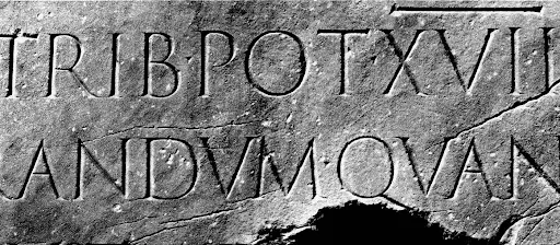
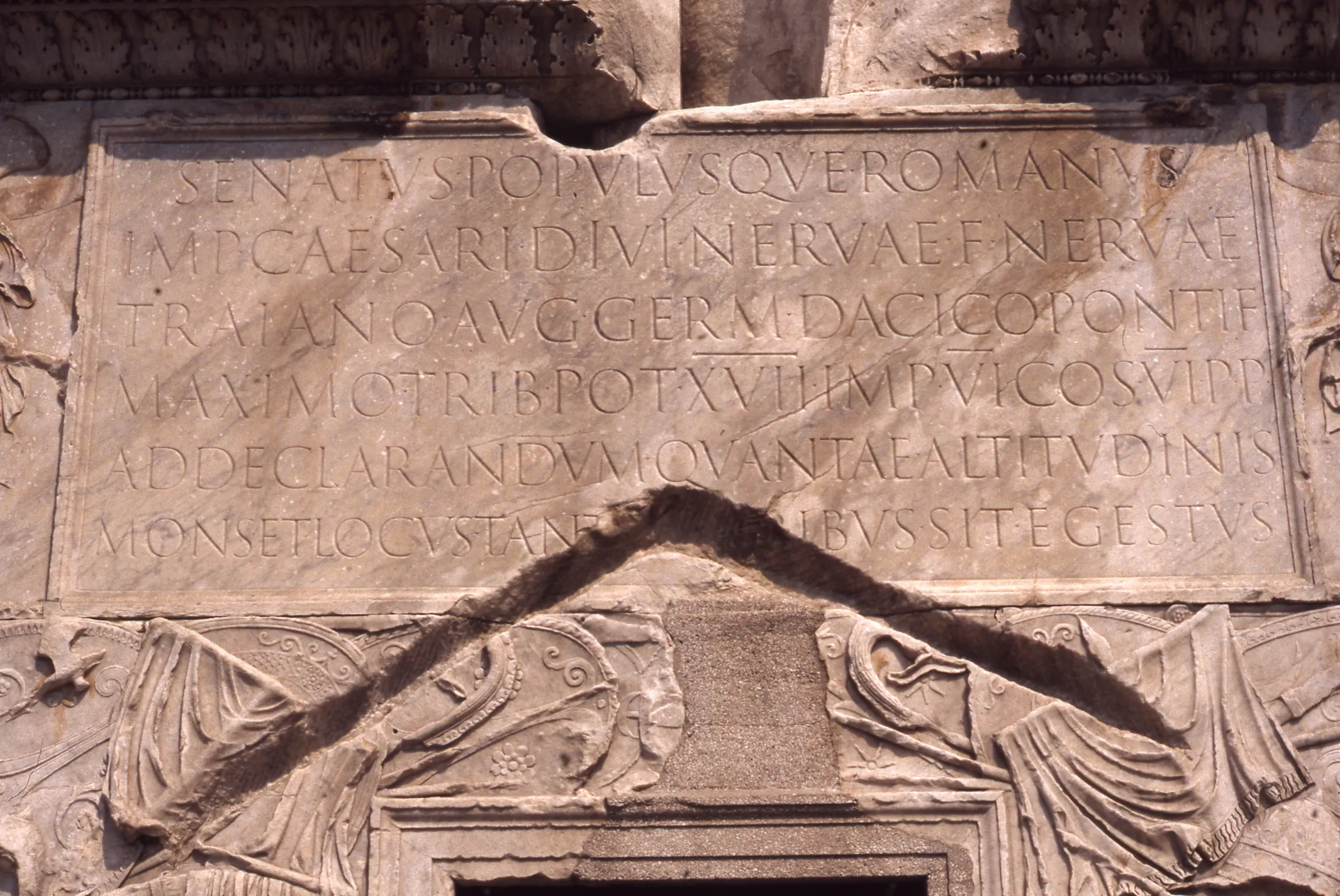
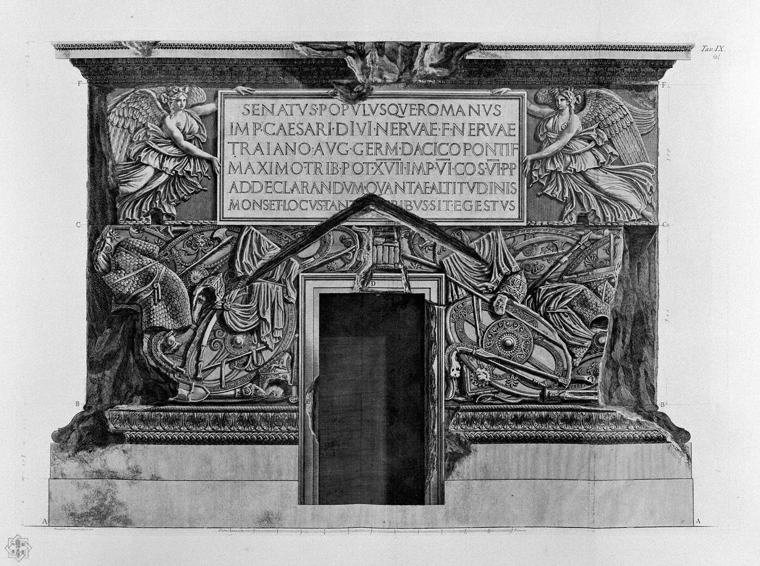
The very oldest examples of intentionally formed letters comes from the Roman Times. A lot has been lost, but the oldest remain in stone. Resistance of the material to writing tool makes for a simplification of strokes and straightening of lines.
↳ Pedestal inscriptions on the Trajan Column in Rome, 113 AD.
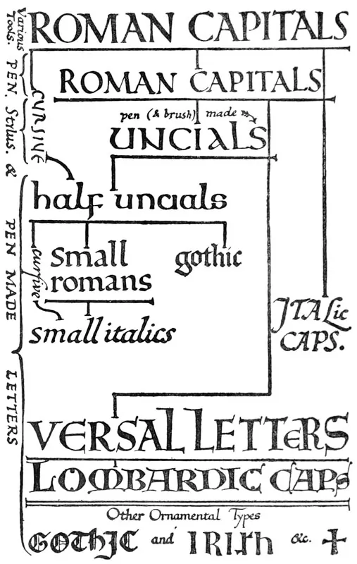
From then, Roman letters evolved into many different forms and shapes. They migrated from Italy to the North, East and West, becoming more elaborate and strikingly beautiful.
↳ “Family Tree” of the Roman inscriptions development.
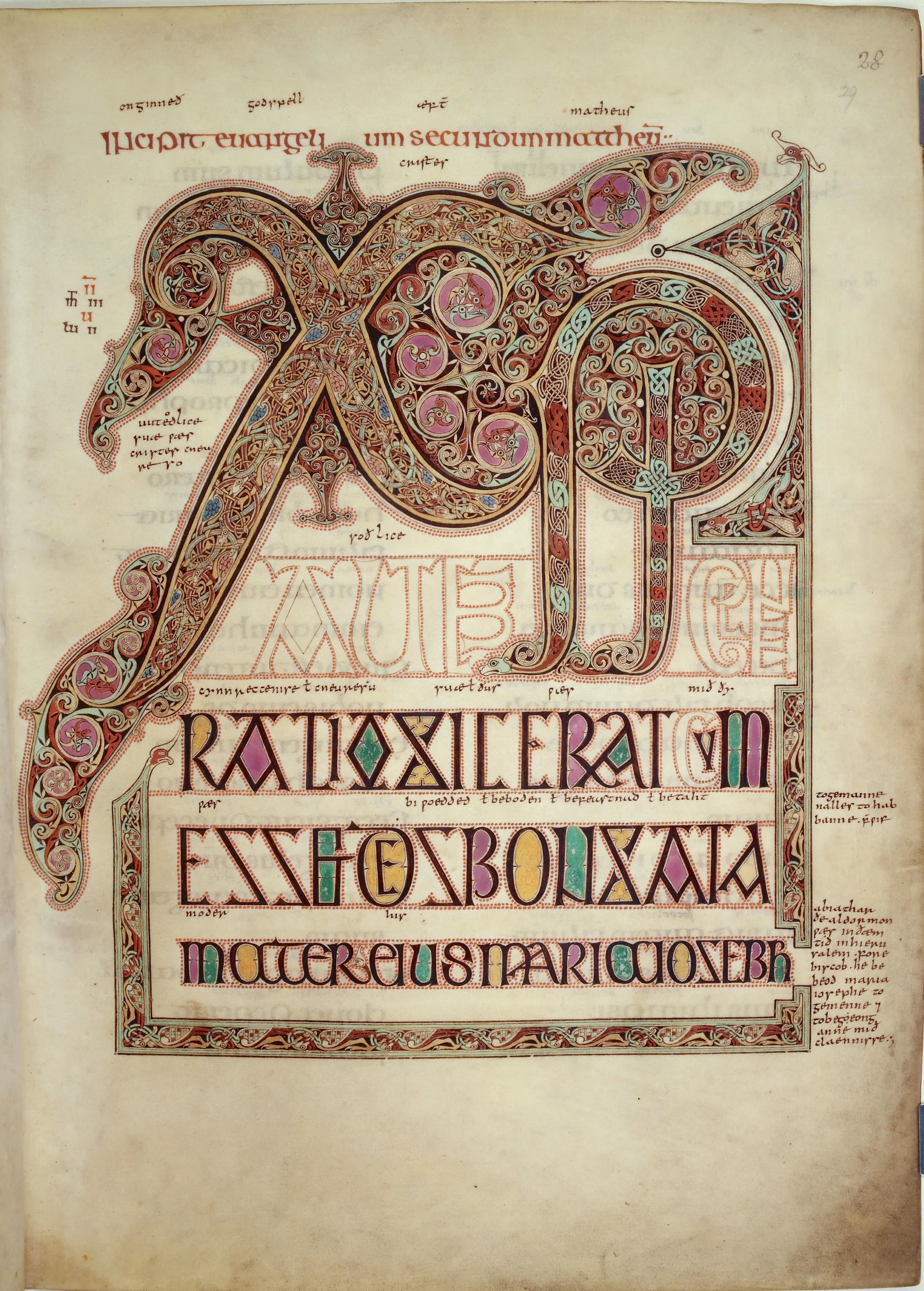
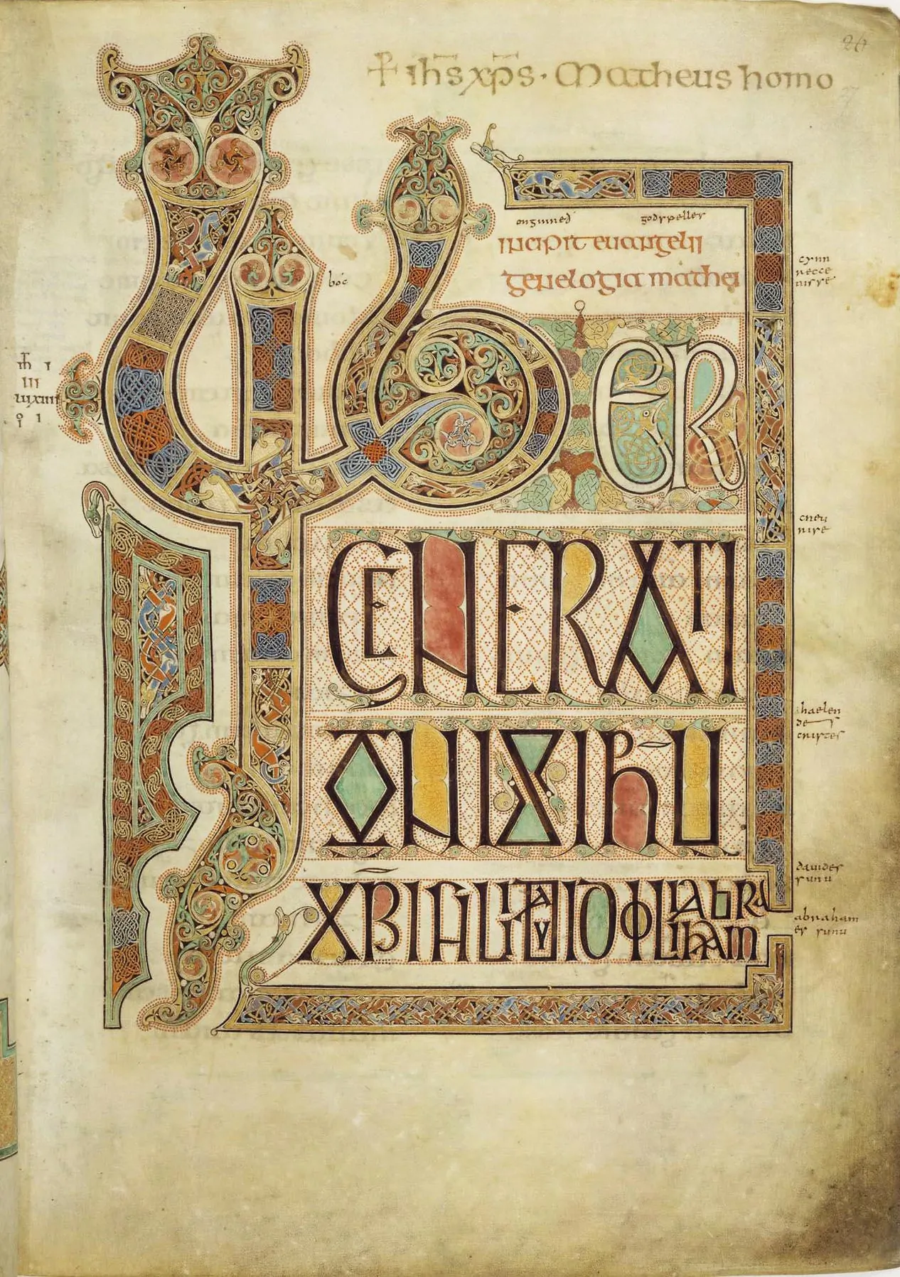
Peoples of the former Roman Empire — dwellers of the British Isles, modern-day Central Europe, France and Italy — have significantly developped art of lettering in the early Middle Ages. Most of them are found in illuminated manuscripts.
↳ Pages from Lindisfarne Gospels, Northumberland (modern UK), 715–720
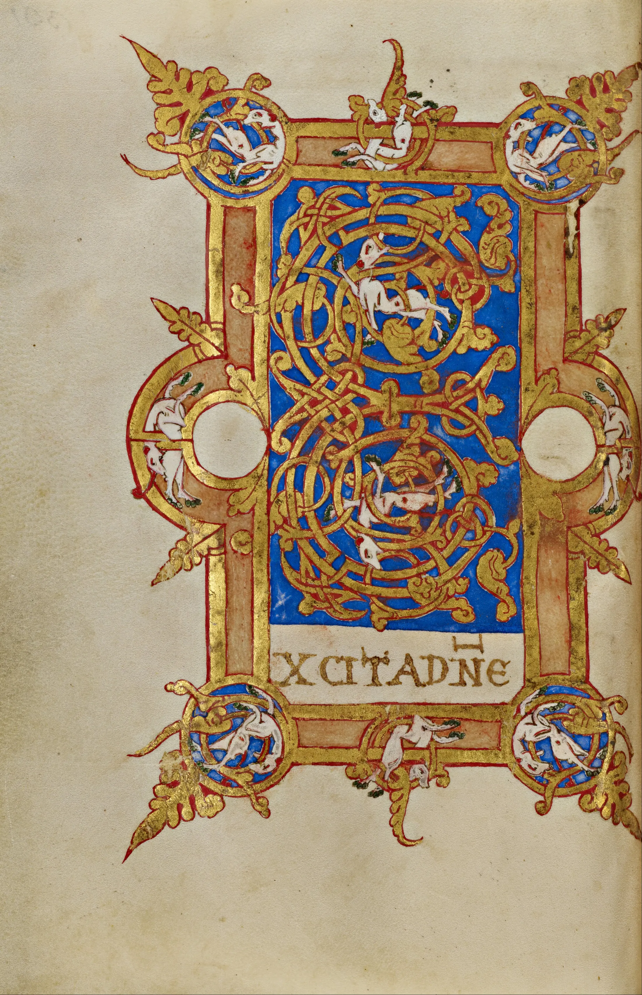
Imagination did not stop, and slowly ornamental decorations turned into full-scale paintings inside letters.
↳ Inhabited Initial E. Montecassino, Italy. 1153
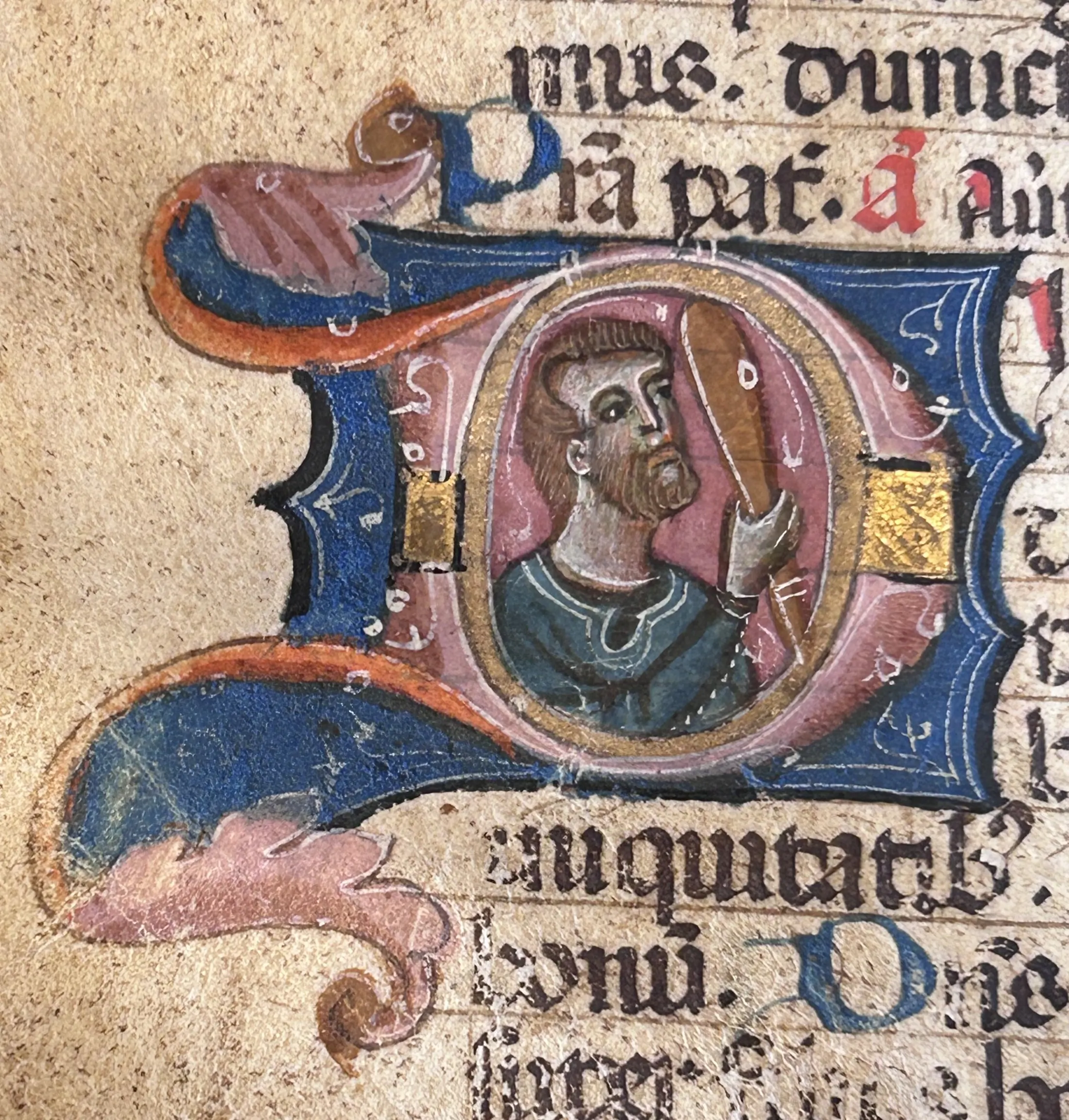
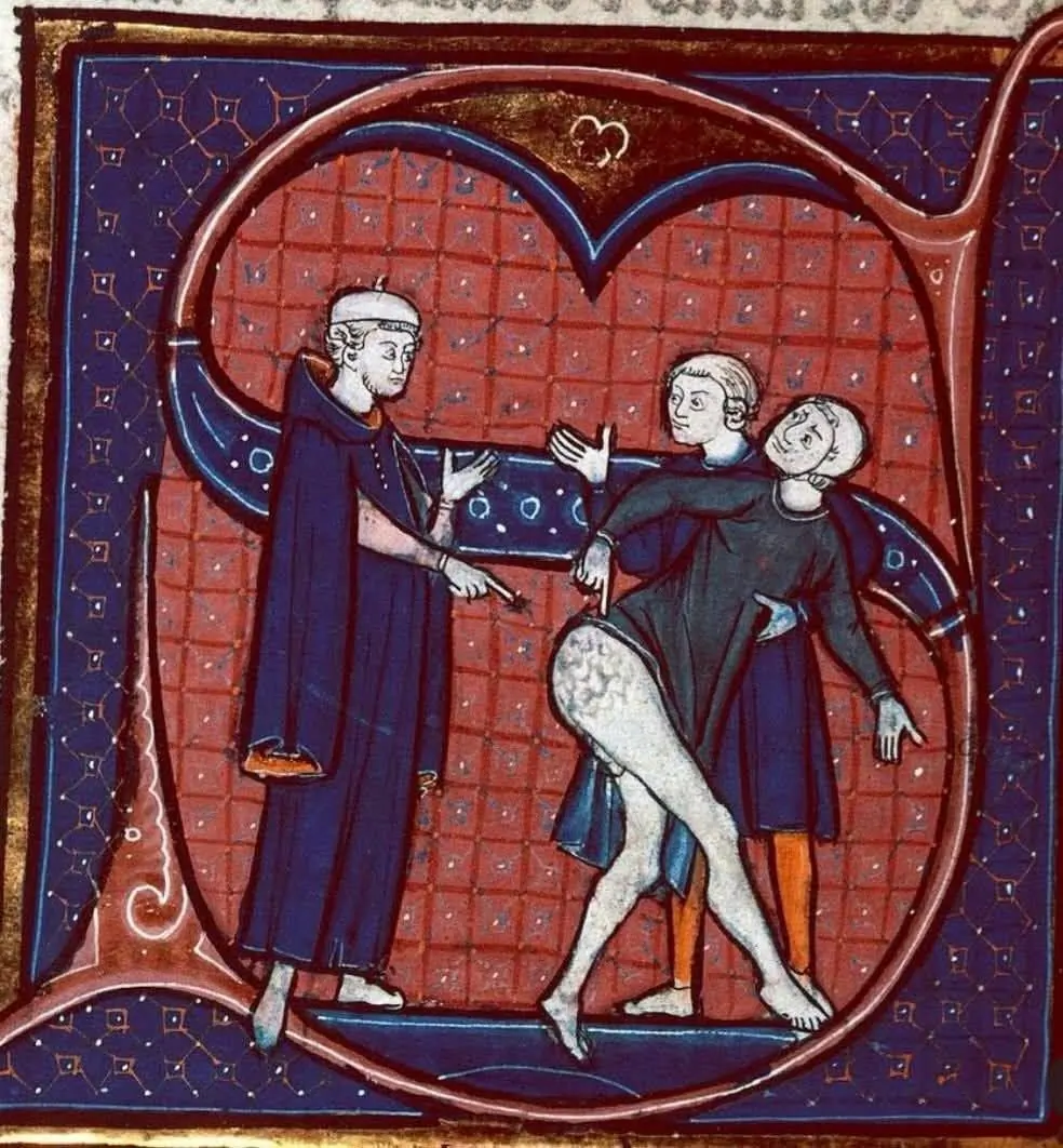
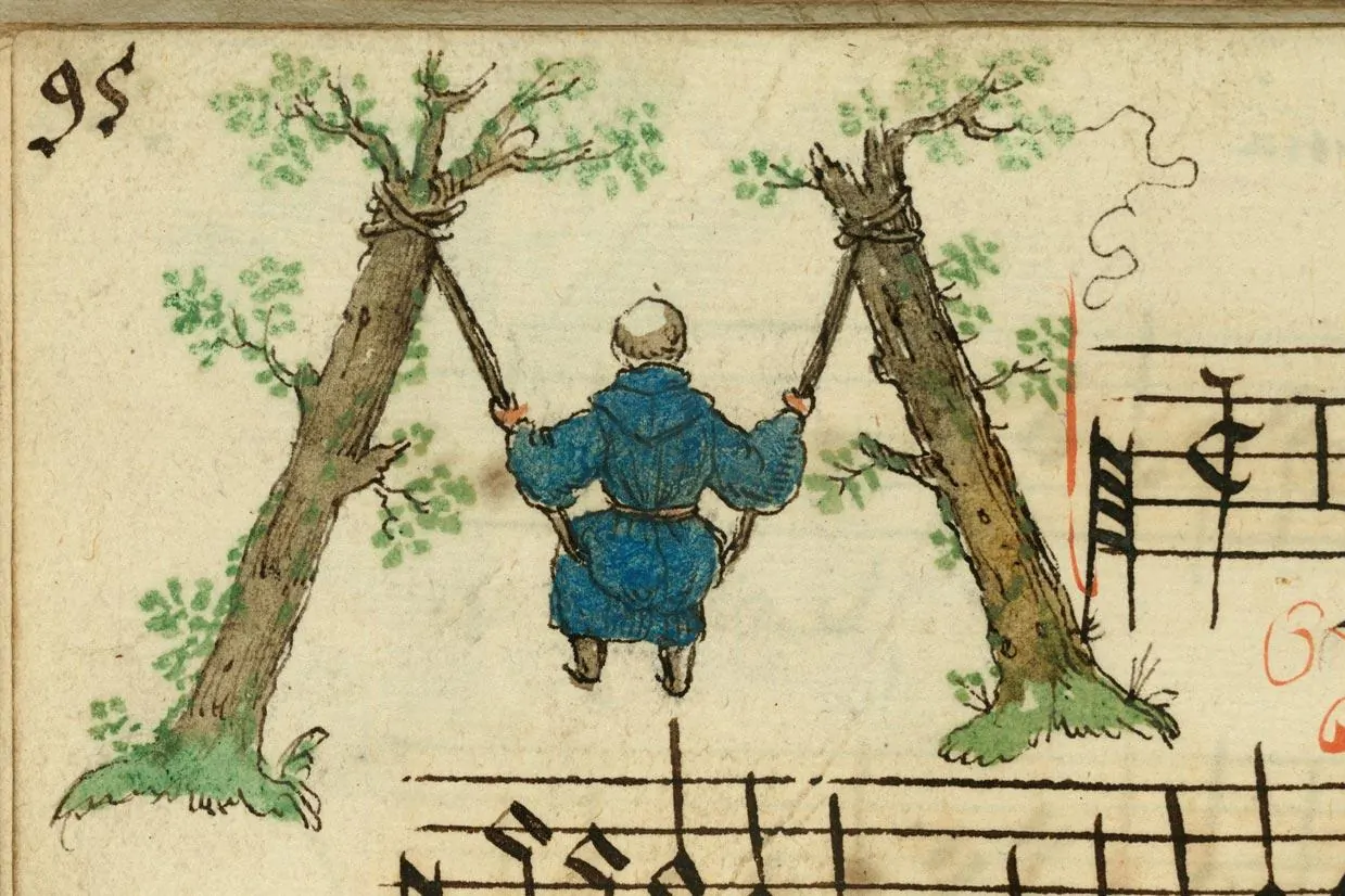
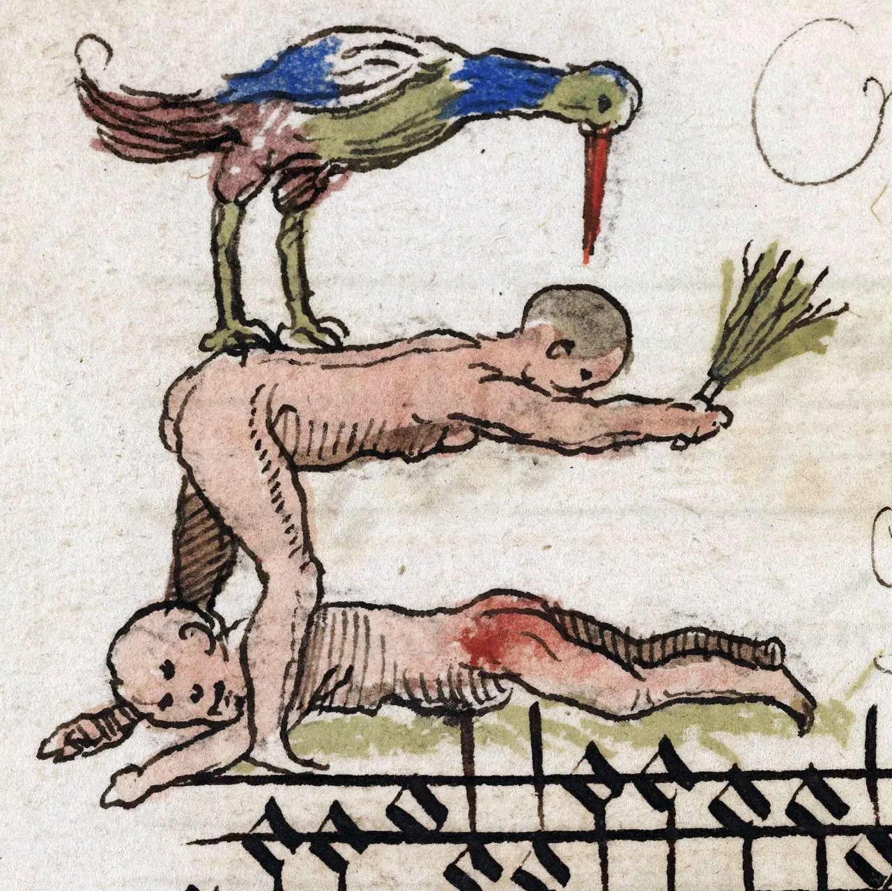
Some more whimsical examples.
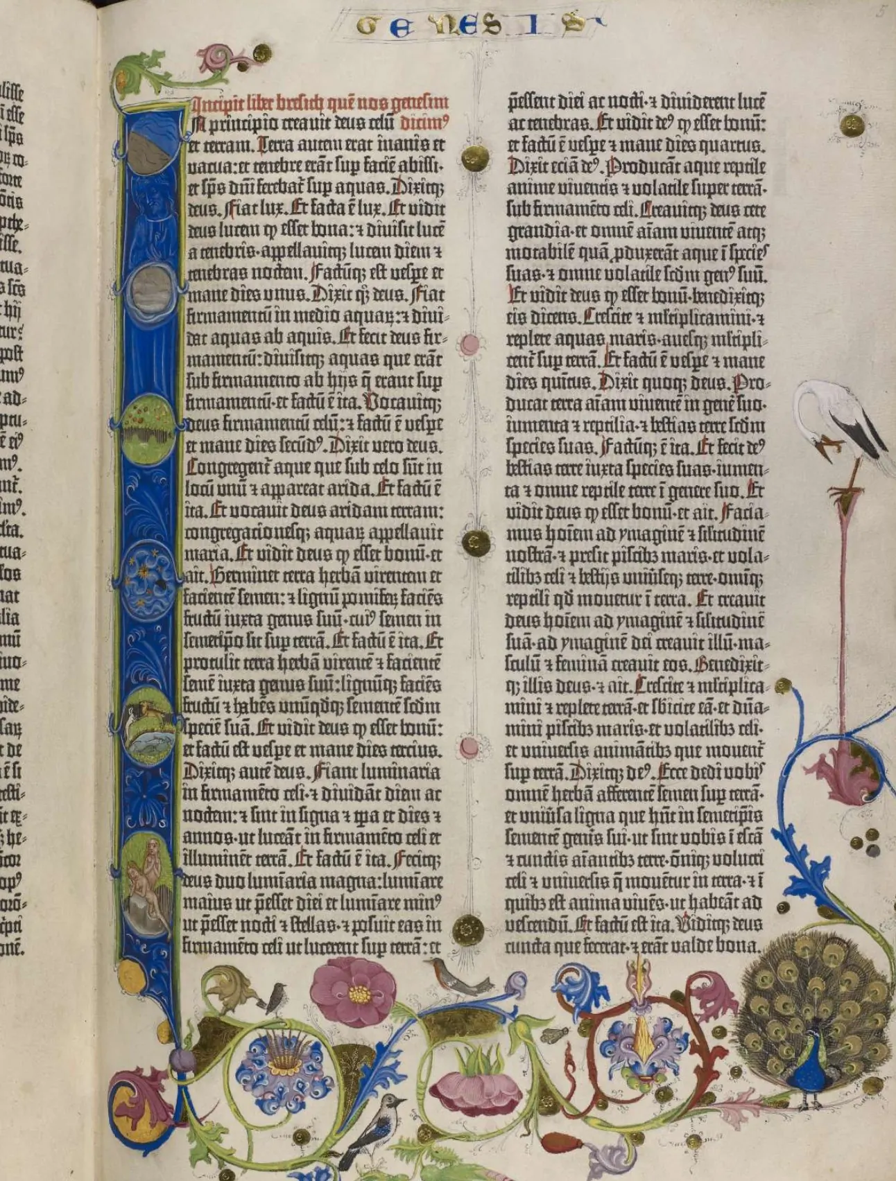
Gradually, decorative elements moved from just Capital letters to all vowels and consonants in use. The process was also driven by the invention of the printing press which made book production much faster.
↳ Page from the Gutenberg Bible, 1455
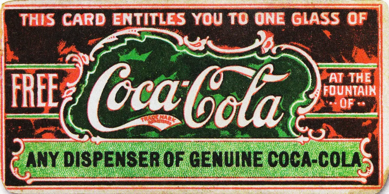
Next significant change to the Letter happened after the industrial revolution: it became irreplaceable part of advertising.
↳ Coca-Cola lettering by Frank M. Robertson
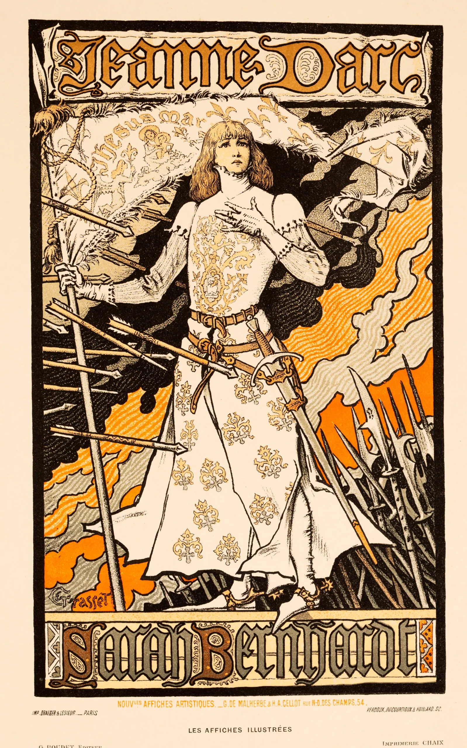
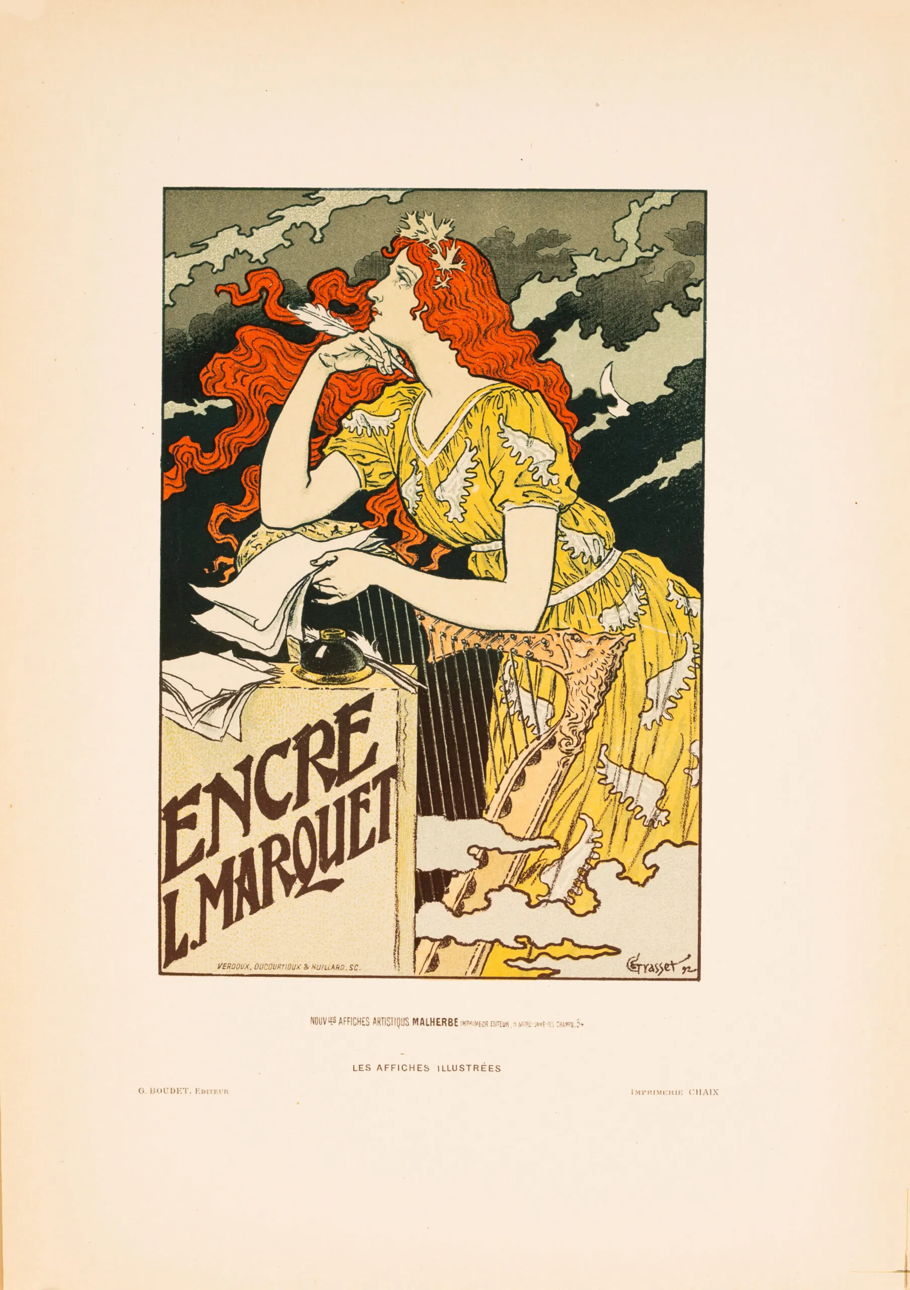
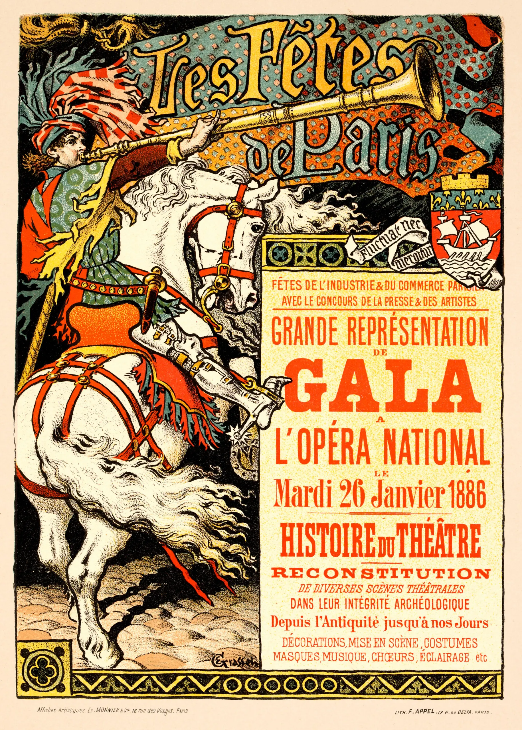
Industrial revolution also re-sparked interest to everything floral and natural motives in visual art — people were tired of straight lines and rationality. Welcome, Art-Nouvuae!
↳ Posters and advertising by Eugene Grasset, 1880-s
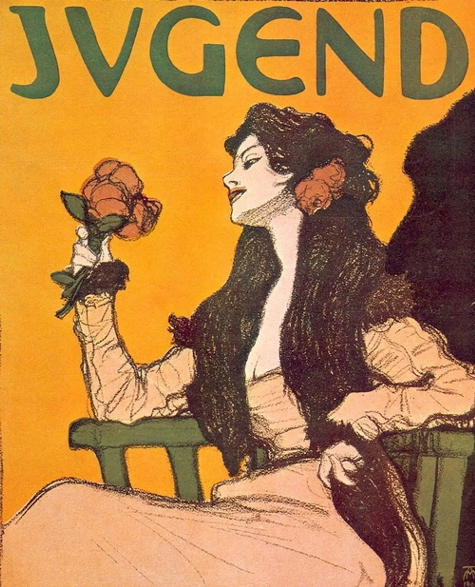
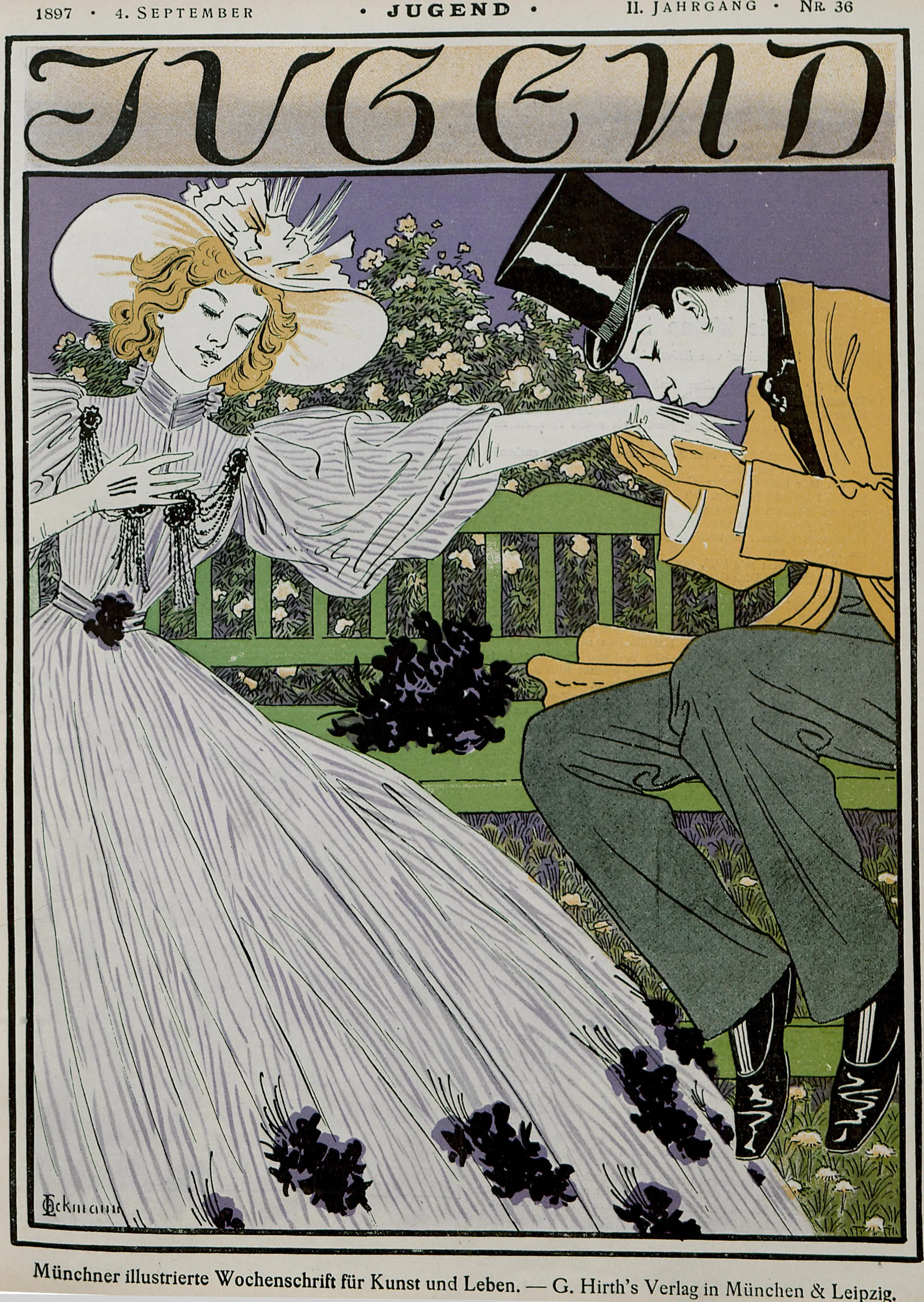
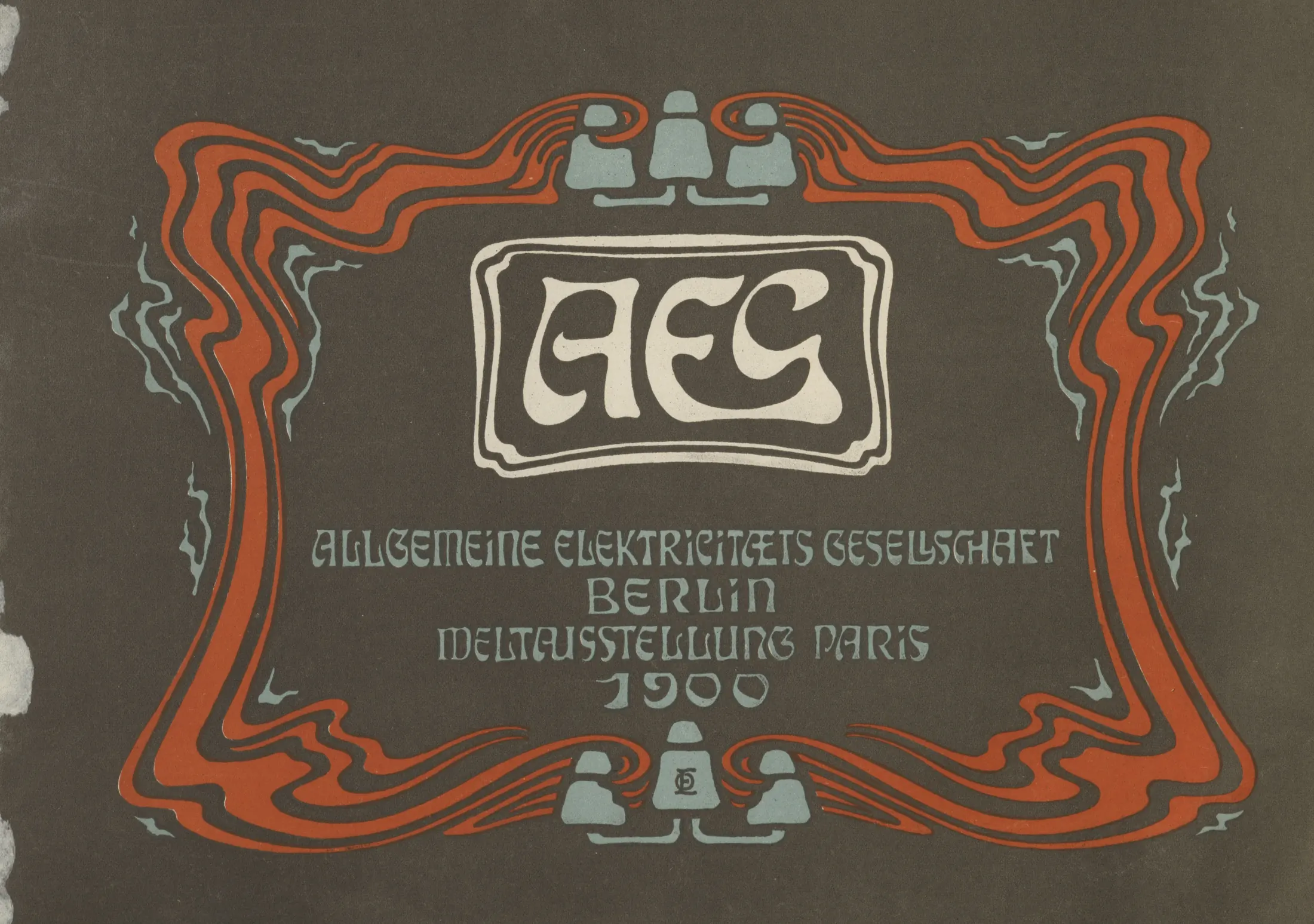
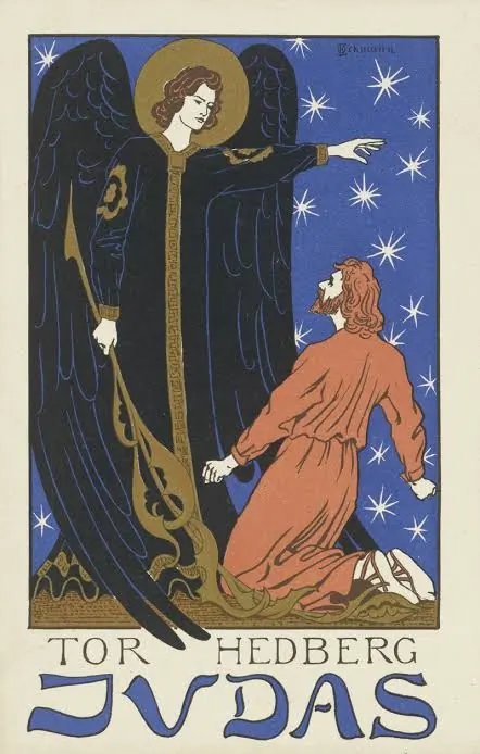
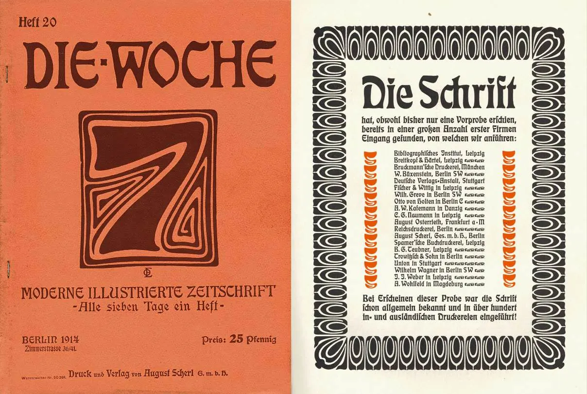
This type of lettering was especially loved by the Jugendstihl artsits of the early XX century!
↳ Posters and advertising by Otto Eckmann, late 1890-s
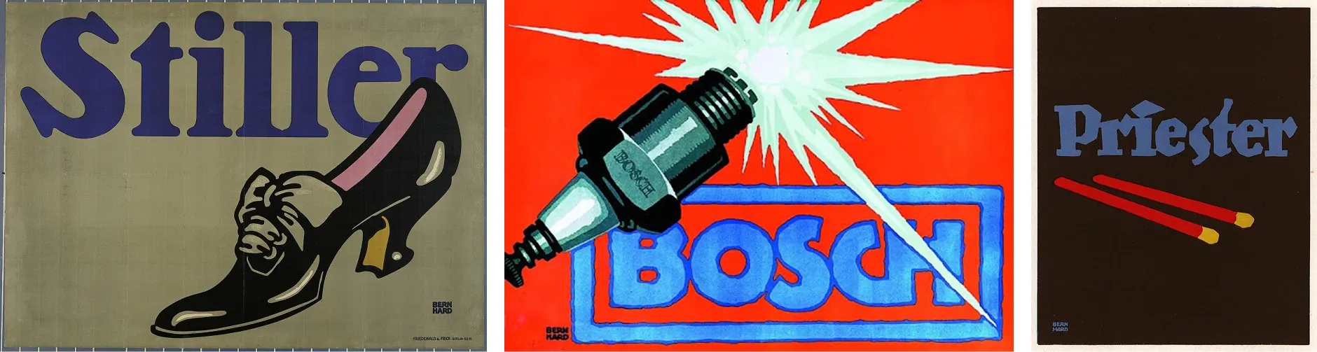
And some more advertisment!
↳ Lettering for advertising by Lucian Berhard
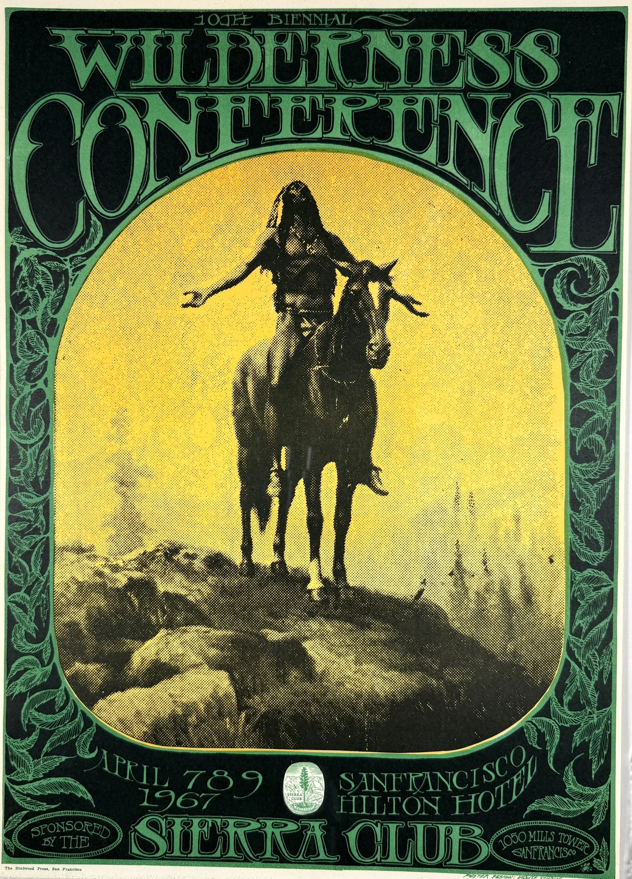
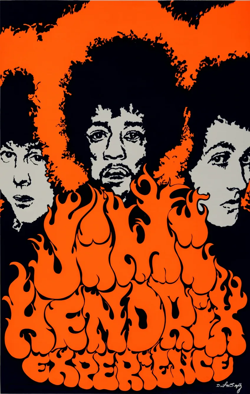
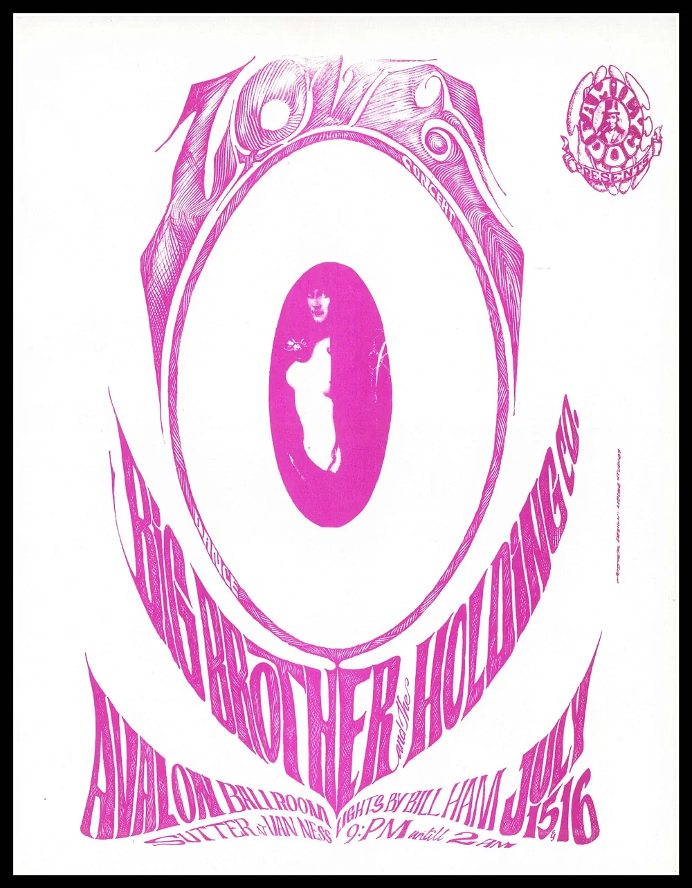
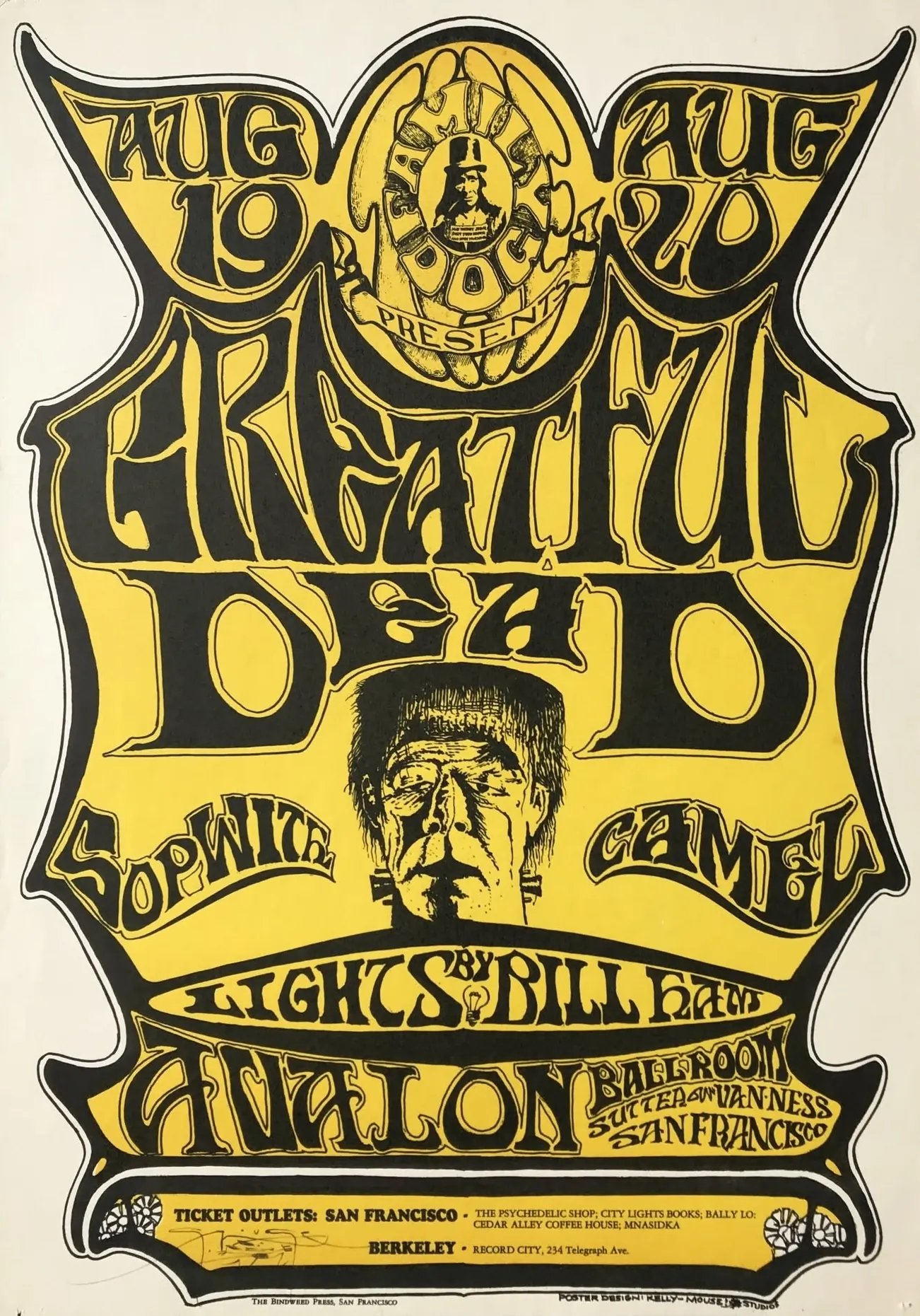
If looking at letters above made you think of psychedelic rock, then you are not wrong! In the 60-s many designers drew inspiration from floral designs of Jugendstihl posters for their musical posters. The whole gang was there: Hendrix, Janis Joplin, Grateful Dead.
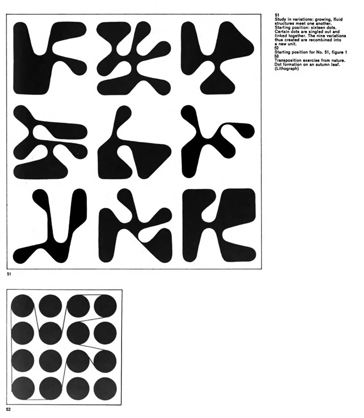
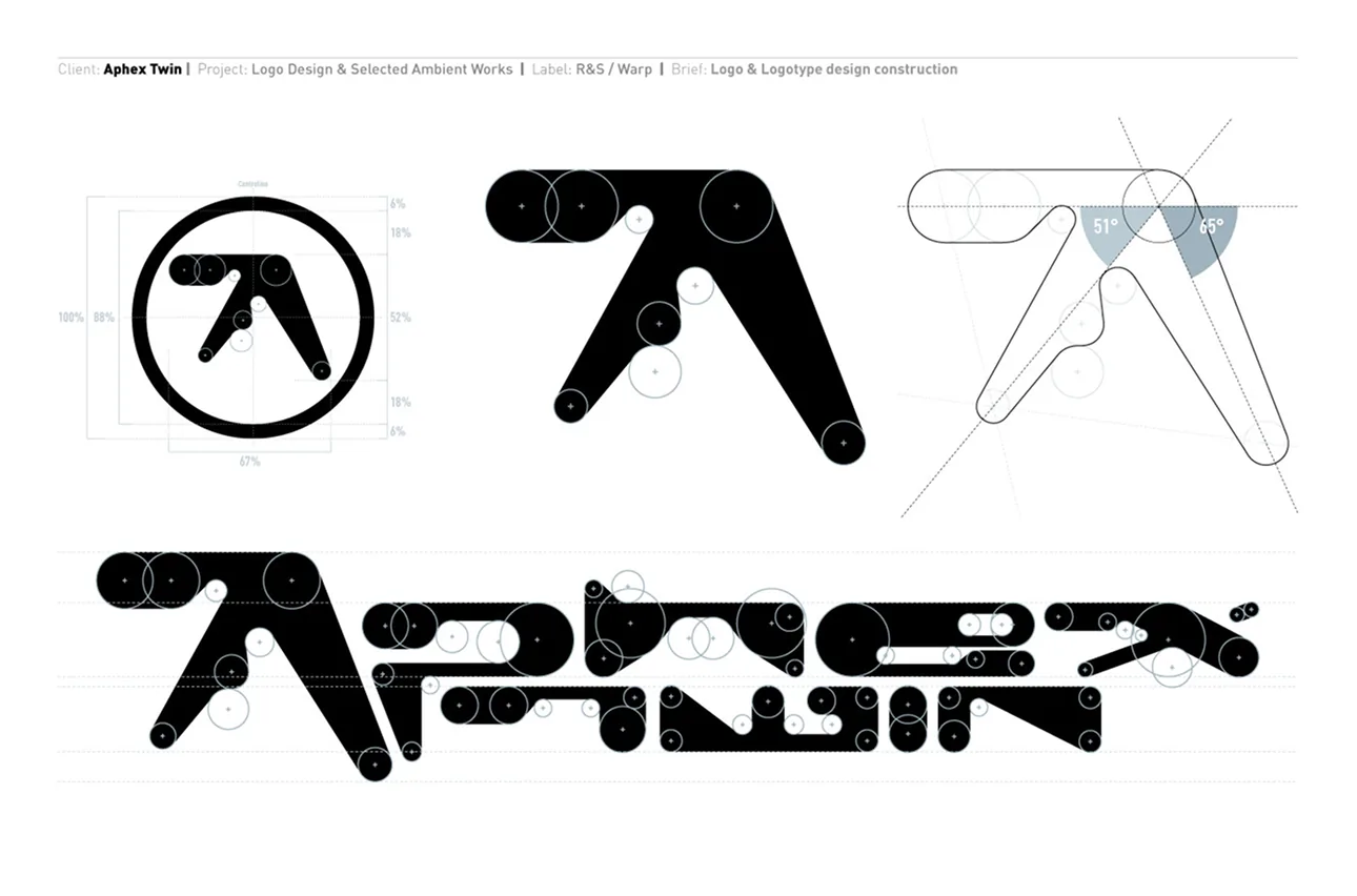
The tradition continued well into the end of XX century — reimagined multiple times, of course! Expressive naturalistic details were replaced by soled shapes. Yes, like that Paul Nicholson’s logo.
↳ Shape from Armin Hofmann’s Graphic Design Manual.
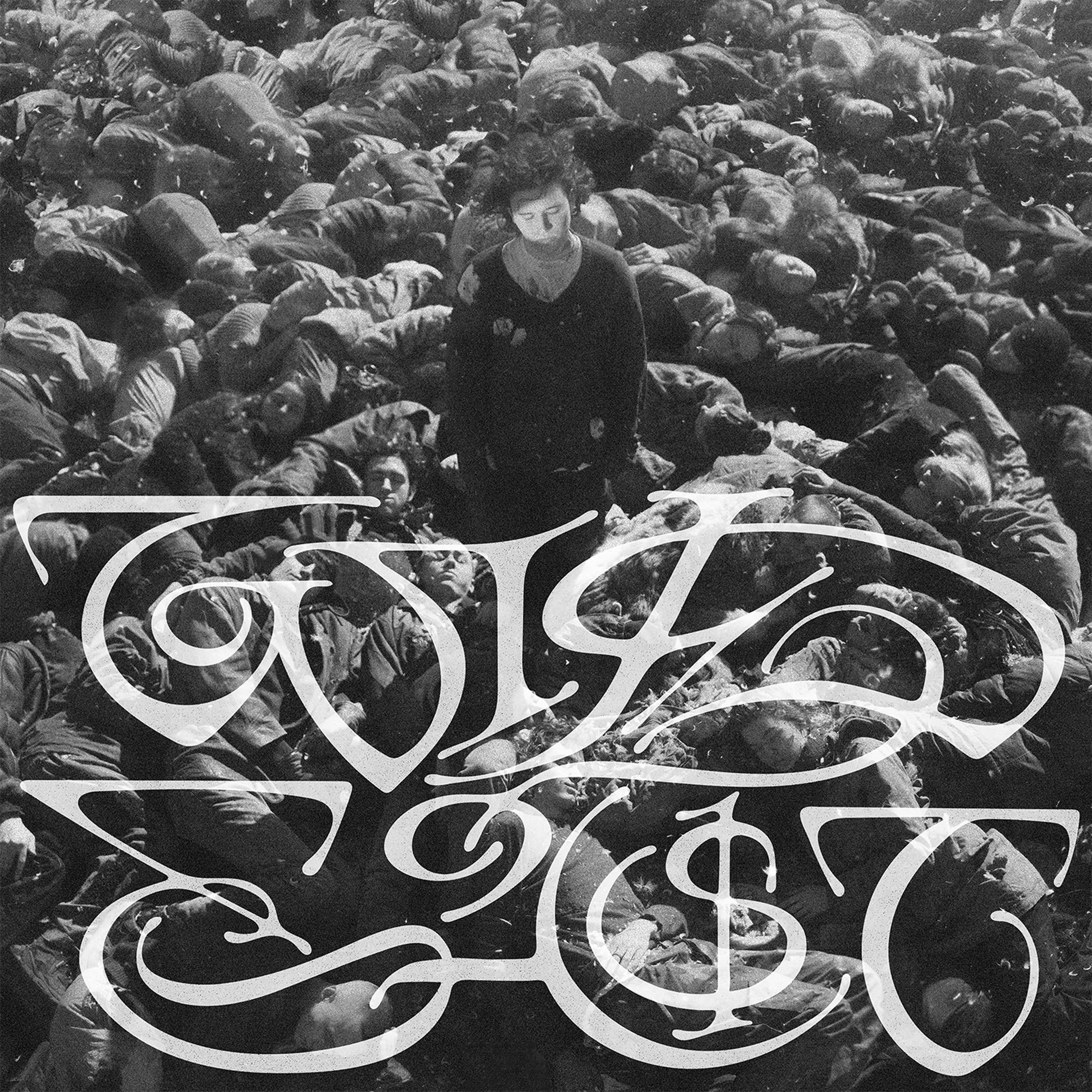
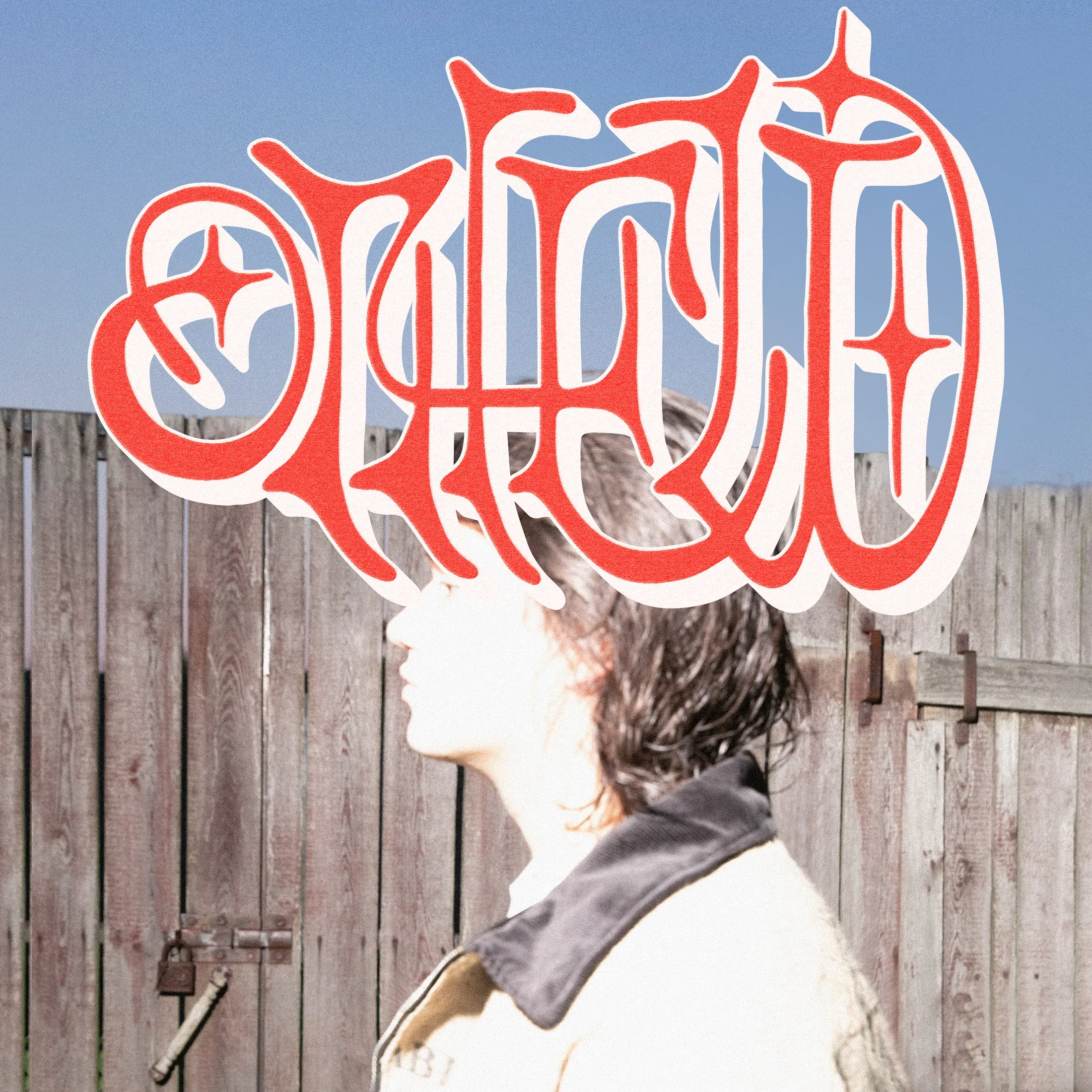
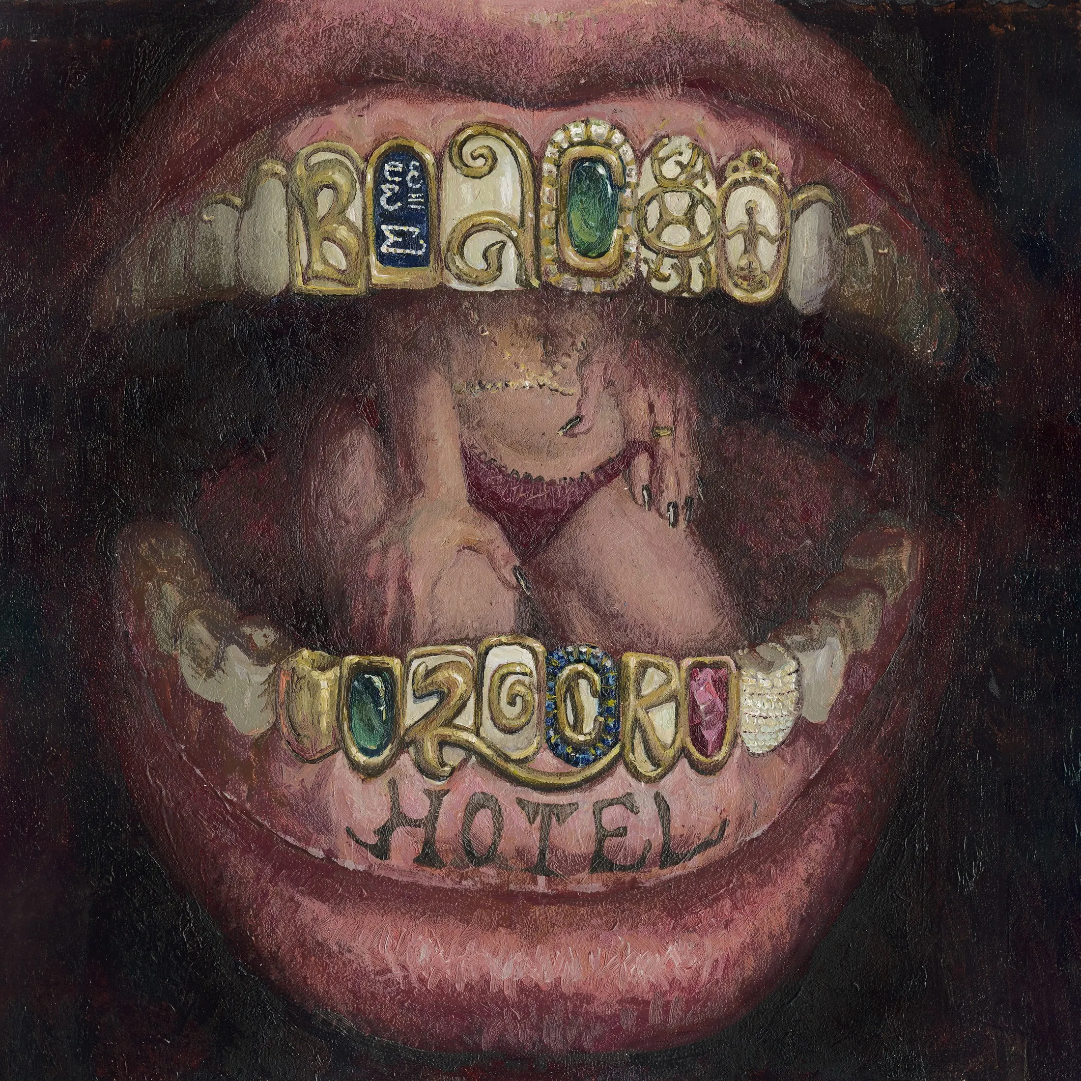
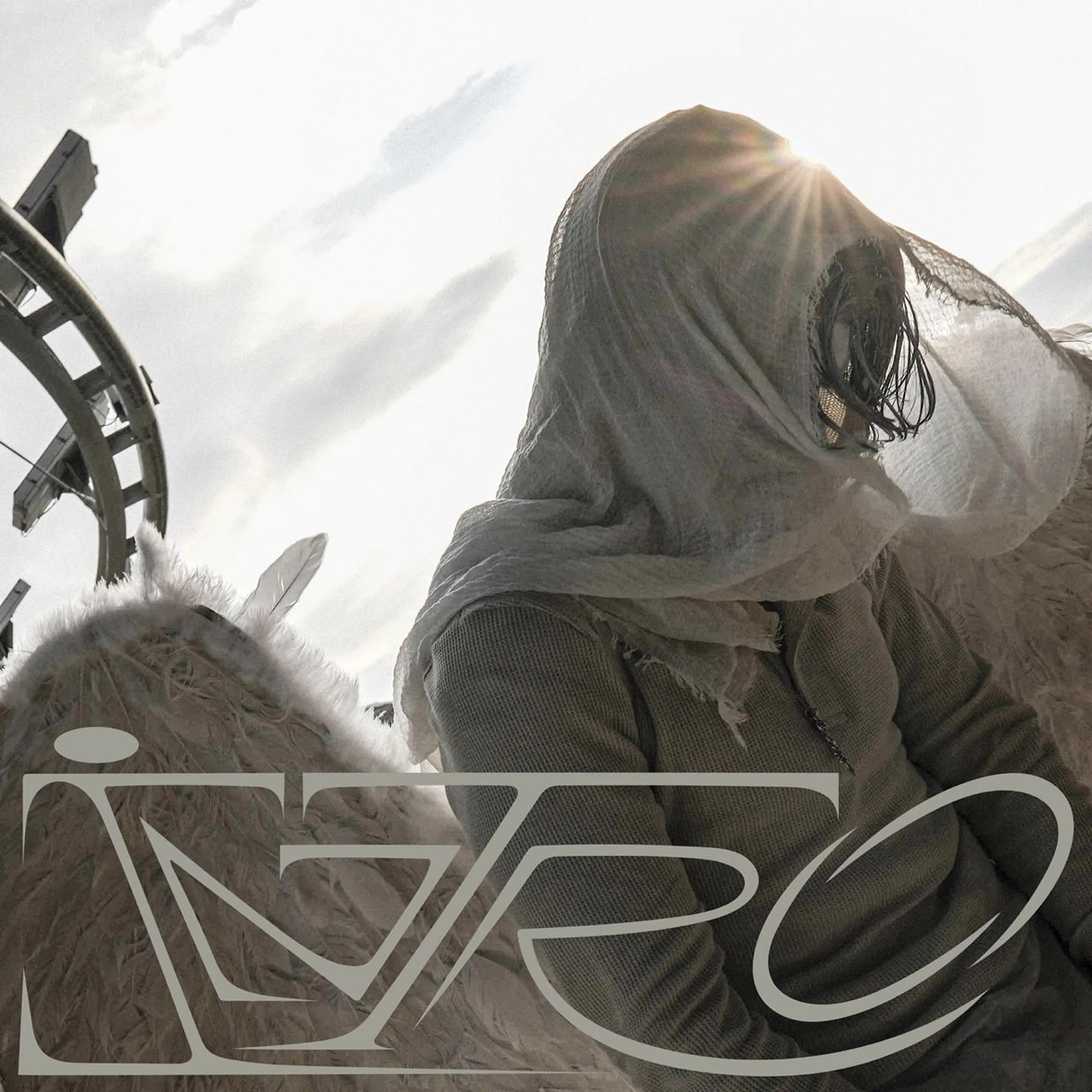
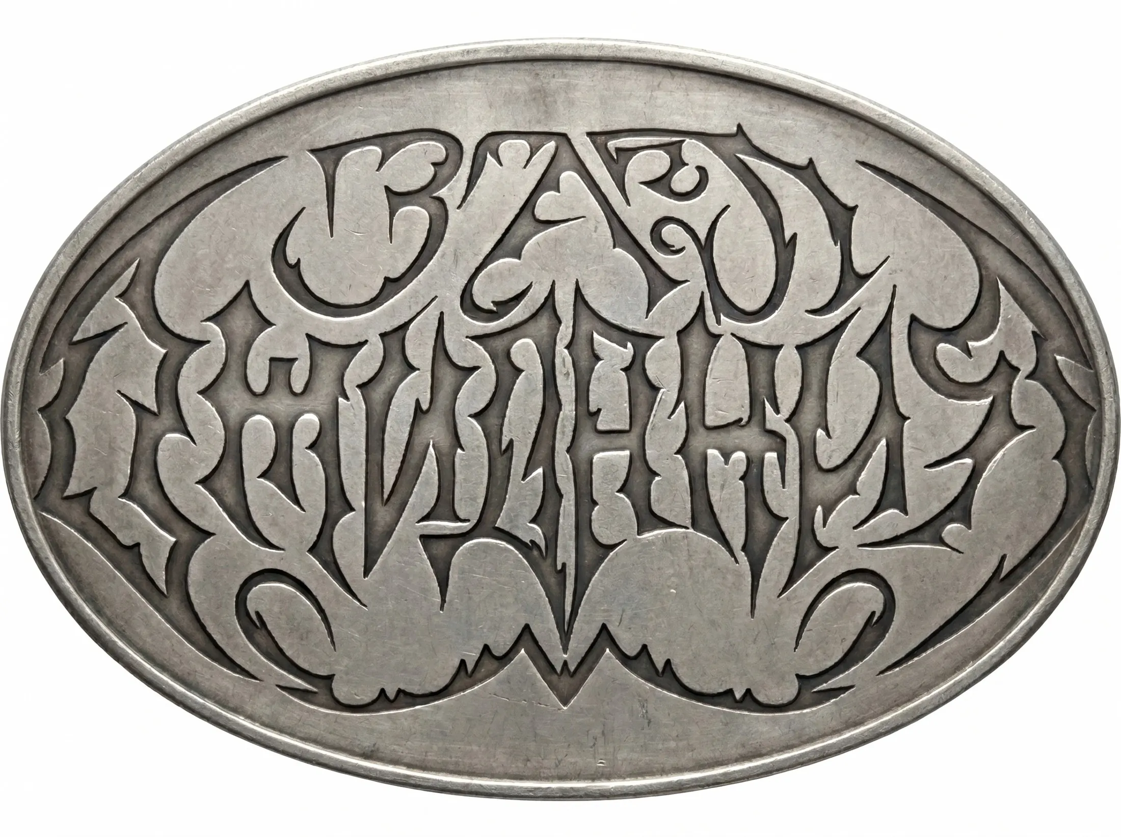
Art of the letter is very alive and kicking even now!
↳ Works by Vanök.Regular, author of LETTER course in käik
If you are eager to explore art of lettering even more, here are some suggestions from käik.pictures:
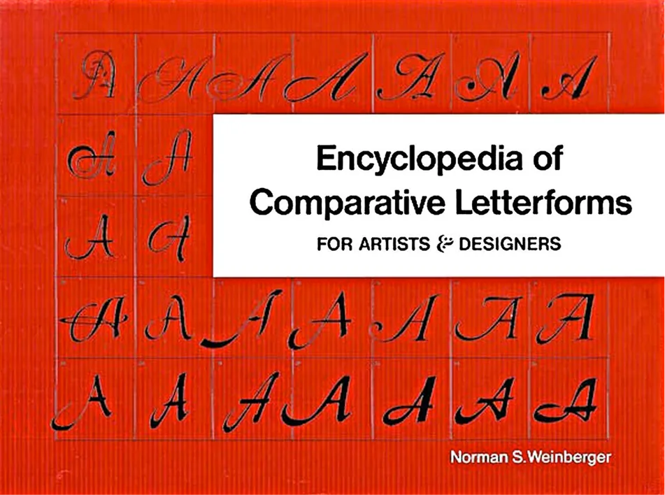
Encyclopedia of Comparative Letterforms, Norman S. Weinberg
Graphic Design Manual, Armin Hofmann
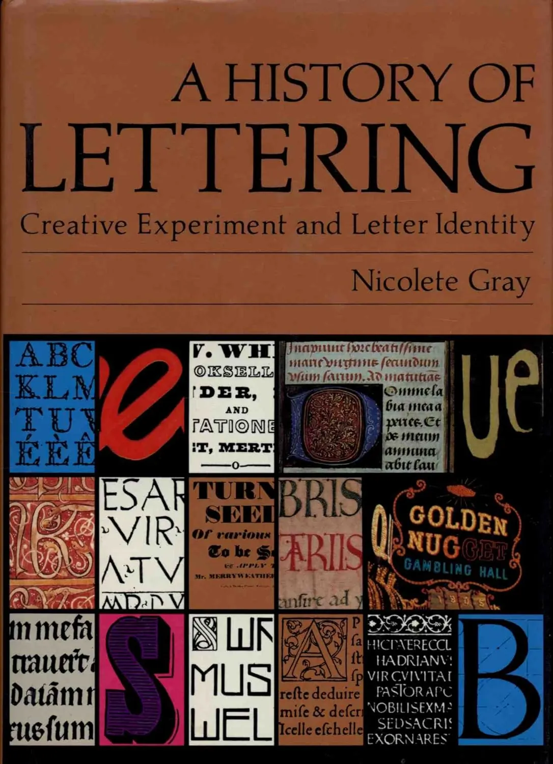
A History of Lettering, Nicolete Gray
And join LETTER class